


Key Takeaways
- KX shares its own measurements of the new KX NYSE TAQ benchmark at benchmark.kx.com.
- The dashboard follows and extends the industry standard for presenting benchmark results, adding details such as memory usage and hardware information, with hover tooltips on nearly every element
- Any view you create by setting selections is encoded in the URL, so you can share it with colleagues as a plain link.
In the first post of this series we introduced the KX NYSE TAQ benchmark: an open-source, reproducible benchmark suite built on real NYSE trade-and-quote data, with 84 queries that reflect what capital markets practitioners actually run in production. You can run the benchmark yourself on your own hardware, or you can explore the results KX has already collected, using the KX Benchmark Dashboard: benchmark.kx.com
Raw result tables would not do the benchmark justice. It covers multiple engines, several configurations per engine, different machines and thread counts, and 84 queries of quite different character, so the interesting questions depend on who is asking. Which engine wins on single-instrument lookups? Does the ranking change when every core is used? How much memory does the speed cost? The dashboard lets you answer these yourself.
The design is inspired by ClickBench, which set the standard for presenting database benchmark results, and we kept its best ideas: a single self-contained page with no server behind it, and the full state of your exploration encoded in the URL, so any view you arrive at can be shared with a colleague as a plain link. Every control updates every chart instantly, the page supports light and dark themes, and nearly every element has a hover tooltip with more detail.
The page consists of three selector groups and one result group containing several charts and tables. Let’s walk through them.
Selector Group 1: Solutions
The first selector group picks the solutions to compare. Recall from the first post that a solution is an engine together with its full setup (sort order, index/attribute, and data layout), so KDB-X appears in several configurations (sorted, grouped, parted, table dict, SQL interface), alongside KDB-X Python (pykx), Polars, DuckDB (in three configurations), and Pandas.
Library versions matter. Query engines improve from release to release, and a result measured against last year’s Polars may not hold against today’s. Hovering over a solution shows the exact engine version behind the numbers, so you always know what you are comparing.
Quick filters below the solution list narrow the field in one click, for example to open-source solutions only, or to solutions that sort the data by time versus by symbol and time.
Selector Group 2: Benchmark Settings
The second group controls how the benchmark was run and how the results are presented:
- Threads: How many threads were allocated to the query engines. Thread scaling is one of the most revealing dimensions of the benchmark: some engines scale nearly linearly, others plateau early.
- Metric: Which run to consider. Each query is executed multiple times. On the first run the data is likely coming from memory; on the second run the CPU caches have more impact, so hot runs favor engines with cache-friendly execution. The two metrics answer different questions: an ad-hoc research query behaves like a first run, while a repeatedly executed production query is closer to the hot-run numbers.
- Machine: Which server the results were measured on. Benchmark numbers mean little without the hardware context, so hovering over a machine gives a detailed description of the server used: CPU model, core count, memory, OS, and kernel settings.

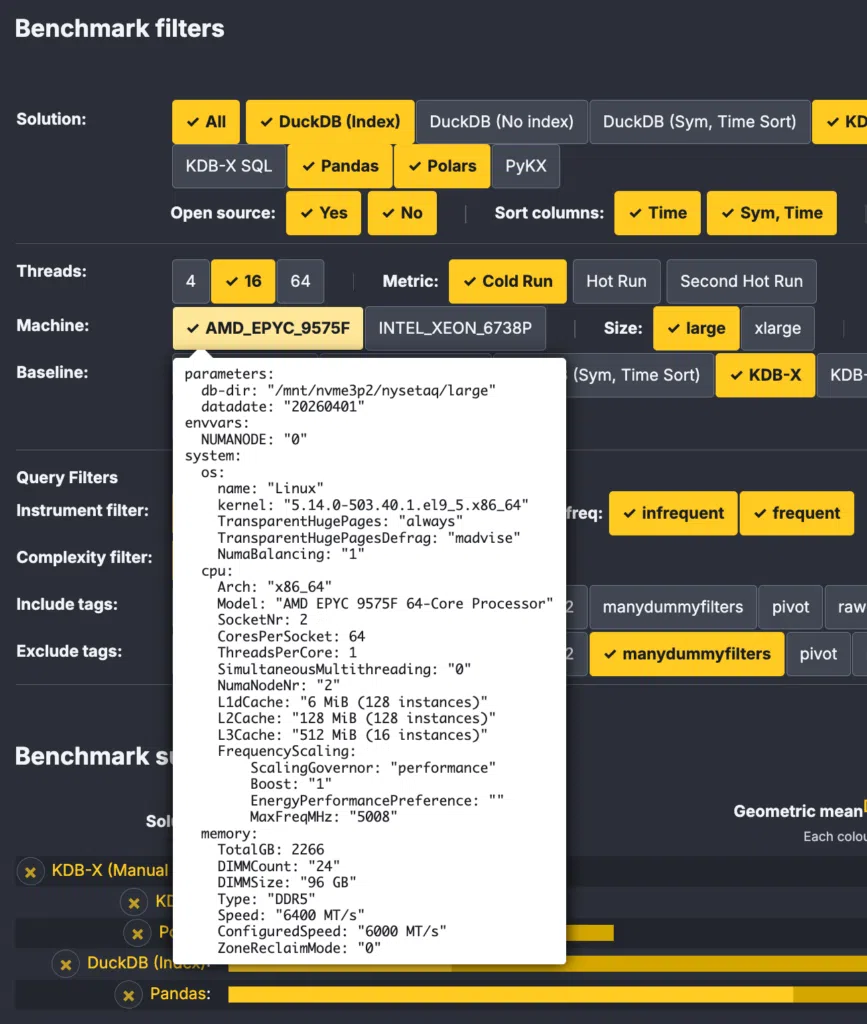
- Baseline: The results are presented as ratios of execution times rather than absolute milliseconds, since the practical question is usually “how many times faster?” and absolute times vary from machine to machine. The baseline selector picks the denominator for these ratios. KDB-X is the default, but any solution can serve as the baseline; measure everything relative to Pandas or DuckDB if that is your reference point. Ratios below one are shown as their inverse, marked with a `-1` superscript: a solution twice as fast as the baseline reads ×2.0-1 rather than ×0.50. This is a useful visualization because it allows a fair comparison — being twice as fast and twice as slow become ×2.0-1 and ×2.00, equal in magnitude and differing only in the sign of the exponent, whereas 0.50 against 2.00 visually understates the speedup.
Selector Group 3: Query Filters
The NYSE TAQ benchmark executes 84 queries, and an aggregate over all 84 can hide as much as it reveals. The third selector group restricts which queries enter the comparison:
- Instrument filter cardinality: Does the query target a single instrument, a few hundred, or the full universe with no filter at all? The filter’s selectivity fundamentally changes how much work an engine must do, and engine rankings often flip between the “needle in a haystack” and “scan everything” regimes. Sub-filters refine this further, e.g. whether the single instrument is a frequently or infrequently traded one.
- Complexity: Restrict the comparison to simple, advanced, or complex queries.
- Tags: Every query carries tags describing its character: as-of joins, pivots, window analytics, and so on. You can include queries carrying at least one selected tag, or exclude queries carrying an unwanted one. Hover over a tag to see its description.
Finding out which engine is best at as-of joins on a single instrument, or restricting the view to complex analytics over the whole market, takes two clicks either way, and every chart and table on the page updates instantly.
The Result Pane
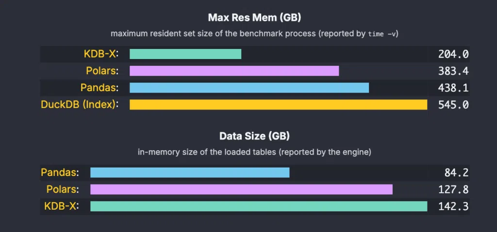
The result group covers both time and memory, since a speedup that requires excessive memory is of limited use in production.
Aggregated Ratios
The headline chart shows the geometric mean of per-query time ratios relative to the baseline, the geometric mean being the statistically sound way to average ratios. Each solution gets a horizontal bar, sorted fastest first; the bars use a dual-scale coloring so both close races and order-of-magnitude gaps stay readable on one chart.

Query Failures
Not every engine completes every query. A run can fail with an out-of-memory error, or a query may not be implemented for a given solution. This poses an awkward question for the aggregate: how should a failed query enter a geometric mean of ratios? Each option trades something away:
- Ignore failed queries: The simplest option, but the most misleading one: a solution could fail on exactly the queries it is bad at and its average would improve with every failure. That is unfair to the solutions that did the work and returned a result.
- Substitute the worst ratio: Fairer, but still too kind. The worst ratio was posted by a solution that succeeded. Scoring a failure the same as the slowest success erases the difference between “slow” and “did not answer at all”.
- Our approach: a penalty beyond the worst: A failed query is counted with twice the worst ratio any compared solution posted for that query. The failing solution lands clearly behind every solution that finished, yet the penalty stays anchored to the actual difficulty of the query rather than an arbitrary constant.
- One case cannot be scored at all: If the baseline solution fails on a query, there is no denominator to form a ratio, so that query is skipped for all solutions.
No penalty scheme is neutral, so the dashboard keeps the failures visible instead of burying them in the average: a bar chart right next to the aggregated ratios shows how many of the compared queries each solution failed on, and failed cells are marked (☠) in the detailed table below. If you disagree with the penalty, the per-query data is all there. Exclude the failing queries with their checkboxes and watch the aggregate recompute.
Wins per Solution
While the geometric mean rewards consistency, the wins pie chart rewards peaks: it shows on how many of the compared queries each solution posted the fastest time. A solution can lose the geometric mean and still win a third of the queries, which a single aggregate number would hide.
 Pie chart showing the number of queries each solution won.
Memory Usage: Two Views
Memory is reported from two perspectives, and the difference between them is itself informative:
- Max resident memory: The peak memory of the benchmark process from the OS perspective (maximum resident set size, as reported by
time -v). This is the amount of memory your machine actually needs. - Data size: The in-memory size of the loaded tables, as reported by the engine itself. This reflects how compactly the engine represents the data. Column types matter here, as we saw in the first post.
A large gap between the two suggests the engine allocates substantial working memory beyond the data itself during query execution.
Detailed Results
Below the summary, the detailed comparison table shows the query execution times of the selected solutions side by side: one row per query, one column per solution, each cell showing the absolute time and the ratio to the baseline, color-coded from green (faster than the baseline) through yellow to red (slower).
Two interactions make this table more than a static listing:
- Each query row has a checkbox. Unselecting queries triggers an immediate update of all aggregated statistics above, including the geometric mean and the wins chart. If you believe a particular query is unrepresentative of your workload, exclude it and see how the picture changes. We did not hand-pick the query set, and you don’t have to accept it either.
- Hover over any cell to see the exact query the given solution executed, pretty-printed with proper indentation: SQL broken at clause boundaries, Python method chains with one call per line. The expressiveness comparison from the first post carries into the results: if a timing surprises you, the code that produced it is one hover away. Hovering over the query number on the left shows the query’s plain-English description and its tags.
 Detailed comparison table showing per-query execution times and ratios for selected solutions, with a query hover tooltip open.
Load Times
Finally, the dashboard reports the load times. Before any query runs, the data has to get into memory, and loading typically consists of three or four steps:
- load the data from disk into memory,
- apply transformations to get the engine’s preferred representation,
- sort the tables, and
- add an index (an attribute in kdb+ parlance).
Each phase gets its own row, again with baseline ratios and color coding. Load times matter more than they first appear: an engine that queries fast but loads slowly pushes the cost to every restart and every intraday reload, and the phase breakdown shows exactly where that cost is incurred.
Try It
The dashboard is live at benchmark.kx.com, and like the benchmark itself, it is open source. If you run the benchmark on your own hardware, the same page visualizes your own results. If you add a new solution, we welcome contributions.
In the next post we dig into what the numbers actually say: how KDB-X and KDB-X Python compare to Polars, DuckDB, and Pandas across the 84 queries, considering speed, memory usage, and solution usability.