

With the rolling in of the New Year we will take a look at visualizing cycles, the latest data visualization challenge from Storytelling with data. KX Dashboards has a range of visuals we can use, so we can look at some of the options available to Dashboards users.
We will start with selecting the data. One thing which has surprised over the course of the Covid pandemic has been gains in the U.S. stock market, so we will dig a little more into this, looking at which industry sectors from the S&P have delivered those gains.
I’ve pulled some data from Stockcharts.com which shows the percentage gain for each sector, starting from the market low in March 2020 – when Covid became a global problem – to the start of the New Year.
We are using freely available KX Dashboards as the visualization tool, following the steps in the video for importing the data. The data is available here for download. The little snippet to add to the demo.q file is:
Sectorcycles: ("IDSF" ; enlist ",") 0: `$":sample/data/SectorCycleData_Jan22.csv";
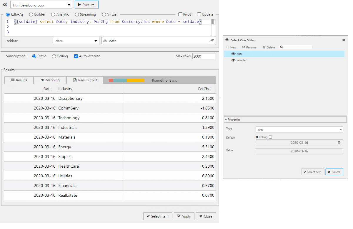
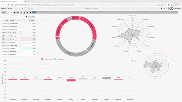
In our Dashboard we start a Data Grid component and set the data source. The data source includes a date view state parameter. This lets us view the data in a standard table and offers a frame of reference for the values.
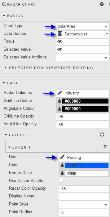
Radar Charts
Next, we can add a Radar chart. There are two forms of this chart: radar and polarArea. We can add both as a comparison
We set Data to use Industry, and add a Layer for the dependent PerChg data.
When we place them side-by-side, we get two charts which look like this:
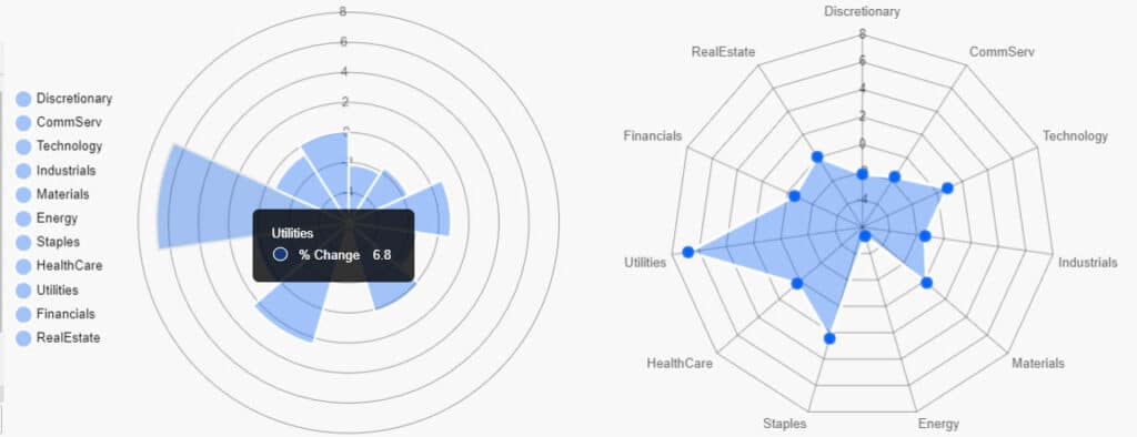
Both charts are a good at showing the relative percentage change for each sector. But both chart types fall down in been hard to discern negative values, although any section near the edge would be considered a leading sector.
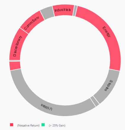
Pie Chart
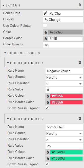
One thing we can look to improve on this is to use a Pie Chart. With a Pie Chart we have a limitation in that the area of the section is determined by the absolute value of the return. However, we can use a Highlight rule to shade in sectors exhibiting negative returns and highlight sectors which make large gains. This gives us a nice visual.
We can improve this by enabling Show Piece Label and Piece Label Arc from Labels and setting the Cut out % from Data to 80%. We then hide the now redundant Legend, and tinker with the Padding to remove the overlap with the Highlight rule legend. This gives us:
Canvas Chart
The one chart which reliably shows the differential between positive and negative values is the humble bar chart. So, we can add a Canvas Chart to our dashboard and configure it as a bar chart. As done with the Pie chart, we can add highlight rules to differentiate between negative returns and gains above 25%.

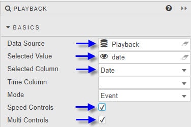
Playback
As a final component, we add Playback to our dashboard. This uses a datasource which pulls the distinct Date values from the query:
select distinct Date from Sectorcycles
We then tie it to our date view state.
Now we can play the sequence of industry sector change over time. This is how our final dashboard looks like with playback enabled.
What does the data say?
In the early part of the Covid pandemic we see hits to Utilities, Financials and Real Estate, while Materials and Consumer Discretionary stocks enjoy gains. The gains were driven by scarcity in raw materials as production and mining slowed, and consumer savings from work at home and government pandemic payment checks helped drive spending in discretionary goods.
As we head into 2021, we see Technology stocks surge as the new work environment changes how people work, and the technology required to support this shift – primarily the need for online teleconferencing and CMS.
With 2021 in the rear view mirror, investors start to look at sectors which may flourish as the world adapts to living with Covid. This includes Financials, as companies look to focus on new investment opportunities in this new world and the debt required to deliver on this, while existing scarcities in oil and gas mean higher prices and profits for the Energy sector.
In the dog house throughout Covid have been Consumer Staples stocks, typically a defensive sector and likely to see a rotation into this sector soon, and Real Estate, the latter hurt by the shift to work from home.
What does your data say to you? Download KX Dashboards and find out for yourself.