


by Declan Fallon
To celebrate Pi Day (3/14) we will construct a dashboard which will show how the mathematical constant for the ratio of the circumference of a circle to its diameter can be estimated. We will use the Monte Carlo method[1].
If a circle of radius R is inscribed inside a square with side length 2R, then the area of the circle will be π R2 and the area of the square will be (2R)2. Therefore, the ratio of the area of the circle to the area of the square will be π/4.
So for n points inside the square, approximately n*( π/4) should fall inside the circle.
For the sequence of random co-ordinates, the point will fall inside the line if x2 + y2 < R2, where x and y are coordinates of the point, and R is the radius of the circle.
The calculation for π is (4*m)/n, where m is number of points inside the circle to total number of points n.
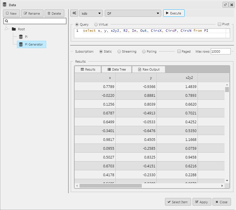
Step 1:
We will start with a sequence of random x and y co-ordinate data, with a column for x2 + y2, and R2 that we will initially display in a Data Grid. We want to use 10,000 values so we set the Max Rows to 10,000. We will come back to the data grid later.
Step 2:
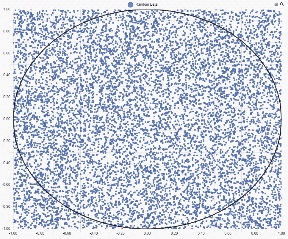
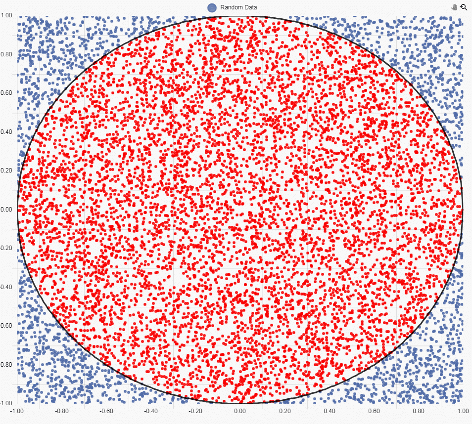
Next, we are going to add a Canvas Chart to plot the data. For the random data points we will use a Bubble chart and then set the x and y column to our axis settings.
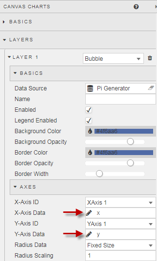
Then we define both X-axis and Y-Axis as a linear relationship, with two decimal places. Our chart looks like this:

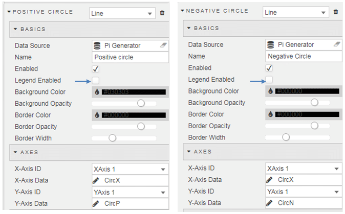
Step 3:
Next, we can add a Circle to our Canvas Chart. To do we will use a Line Chart, which we have configured as two additional layers. I have disabled the Legend as the circle is self-explanatory.
Step 4
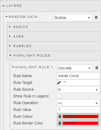
We can show which values are contained inside the circle with a Highlight Rule. As we have a data column which has a value of 1 when the random point is inside the circle, we can set our highlight rule to trigger on the aforementioned column, while applying a color highlight on to the random point itself. This looks like:
Step 5
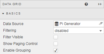
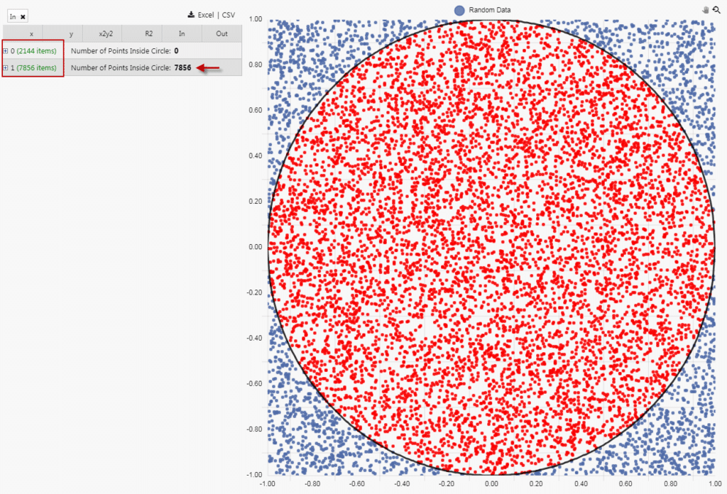
Next, we can go back to our Data Grid and configure it to show the total number of dots inside and outside the circle; this can be done using the grouping feature. First, Enable Grouping.
Then we create a grouping relationship for the sum of the columns which measure the number of random dots inside, and outside the circle. Because we have assigned a value of one or zero depending if the point is inside or outside the circle for the “In” column, a straight sum value will give us the total number of points out of the 10,000 plotted which fall inside and outside of the circle. If you haven’t added a column for the “In” you can do so from the Columns menu – this column assigns a value of 1 when the value of R2 is less than one.
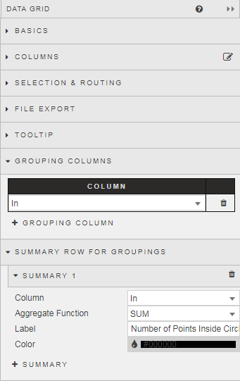
With the grouping enabled, we get a sum total of points inside the circle of 7,856. This leaves 2,144 points outside the circle.
Calculate Pi
From the introduction we have a calculation for π of (4*m)/n, where m is number of points inside the circle to total number of points n.
From the Dashboard, we have a value of m of 7,856, and an n value of 10,000. Our calculation is now
π = (4 * 7,856) / 10,000 = 3.14
Interesting Pi Facts
- The Pi Constant has been calculated to over one trillion digits beyond its decimal point, but as an irrational number the number of digits will continue infinitely, without repetition or pattern. For the more humble soul, knowing just a few digits after the decimal place is enough Pi for anyone.
- In trying to determine Pi, Archimedes used polygons to approximate circles. Although applying this principle to his cart wheel business was not so successful.
- The Greek letter π was first used in 1706 by William Jones, but good luck finding π on your keyboard.
- A Mathematicians duel involves two combatants reciting the longest sequence of digits after the decimal place for Pi. The winner is then shot by the loser.
- The Guinness book of record for memorization of pi is 67,890 digits by Lu Chao of China in 2005. Although Japan’s Akira Haraguchi spat out 100,000 digits in 16 hrs 30 minutes at an event in Tokyo. He can now do 111,700, but is likely not expecting many party invites.
[1] http://www.eveandersson.com/pi/monte-carlo-circle


