Today, we will work with the charting component of KX Dashboards. Dashboards is an interactive data visualization tool for use by non-technical and power users to easily query, transform and present both static and real-time streaming data in informative and visually appealing formats. The WYSIWYG interface is familiar to any user of desktop software, with basic drag-and-drop, point-and-click operations used to design visualizations.
For a little additional flavour will we also take on board this month’s #SWDChallenge. The #SWDChallenge is an informal monthly exercise in data visualization, run by data specialist author and podcaster, Cole Nussbaumer Knaflic. A topic is announced and participants have a couple of weeks to approach the challenge and tell the story through data visualization. The focus of this month’s challenge is to introduce a visualization tool, so we will look to introduce KX Dashboards.
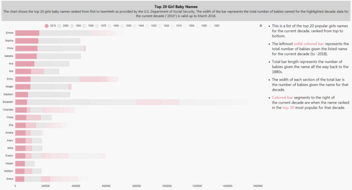
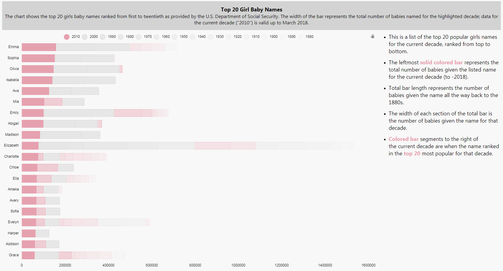
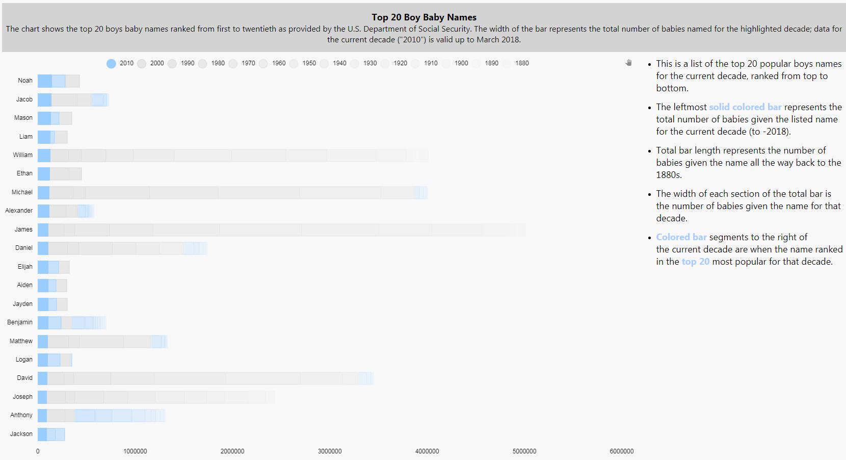
For the challenge we will look at the popularity of baby names over the various decades, dating back to the 1880s, as made available by the U.S. Social Security Administration website[1]. The website offers the results in a standard list of top 200 names but let’s see if we can glean a little more information from this.
The website offers data for each decade going back to the 1880s, so this will give us a chance to see patterns in naming over time. As a starting point I have aggregated the data into a kdb+ database. To focus the article a little more I’m going to show the top 20 girls and boys names for the current decade.
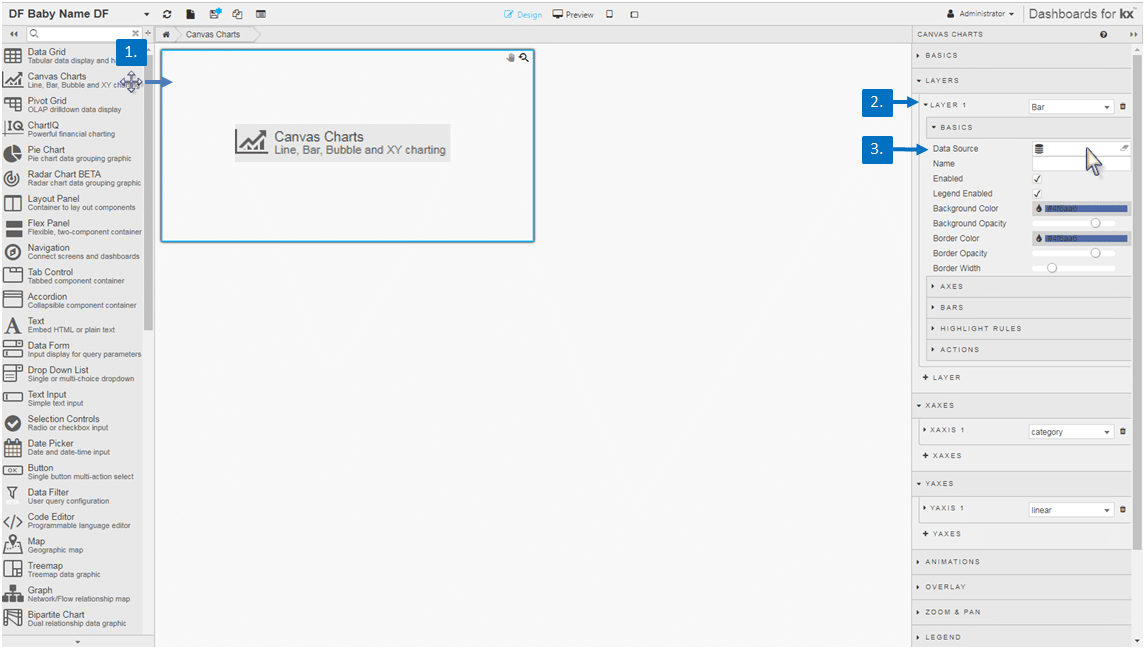
We are going to start with a Canvas Chart component. Drag this into your Dashboard and add a new Layer. Then we need to create a Data Source.
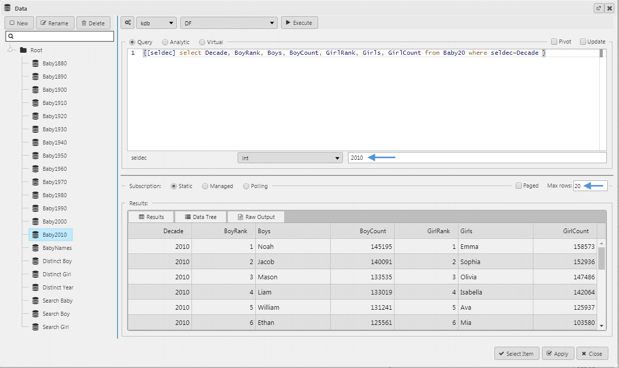
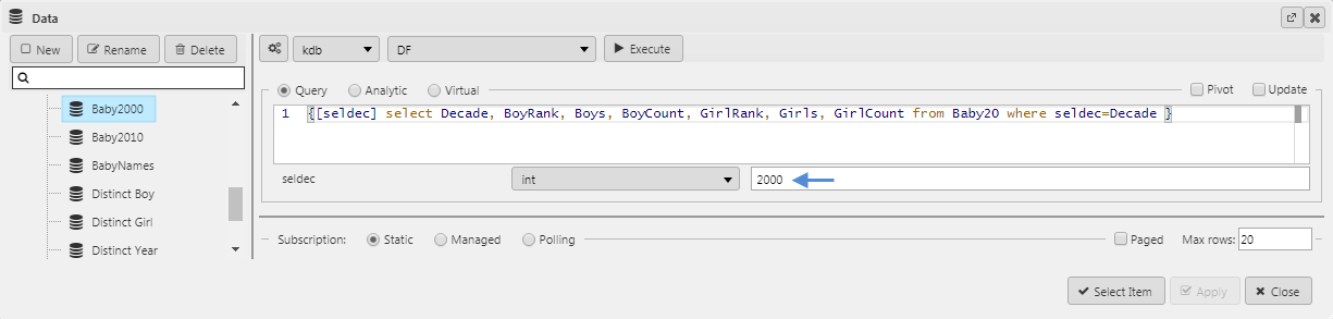
In my query I have an included a selection variable which will allow me to create subsets from my parent data for each decade by changing this value. These subsets will form the different chart layers added later. I will also set the Max rows variable to 20 so I only return the top 20 results; if you wanted to pull all top 200 results you can leave this value unchanged at the default value. For more information on creating a query inside KX Dashboards see my opening post in this Insights series.
Next step is to configure the Canvas Chart by defining the Axes for what we are charting on the x- and y-axis. We will also make this a horizontal chart, so we also need to enable Transpose.
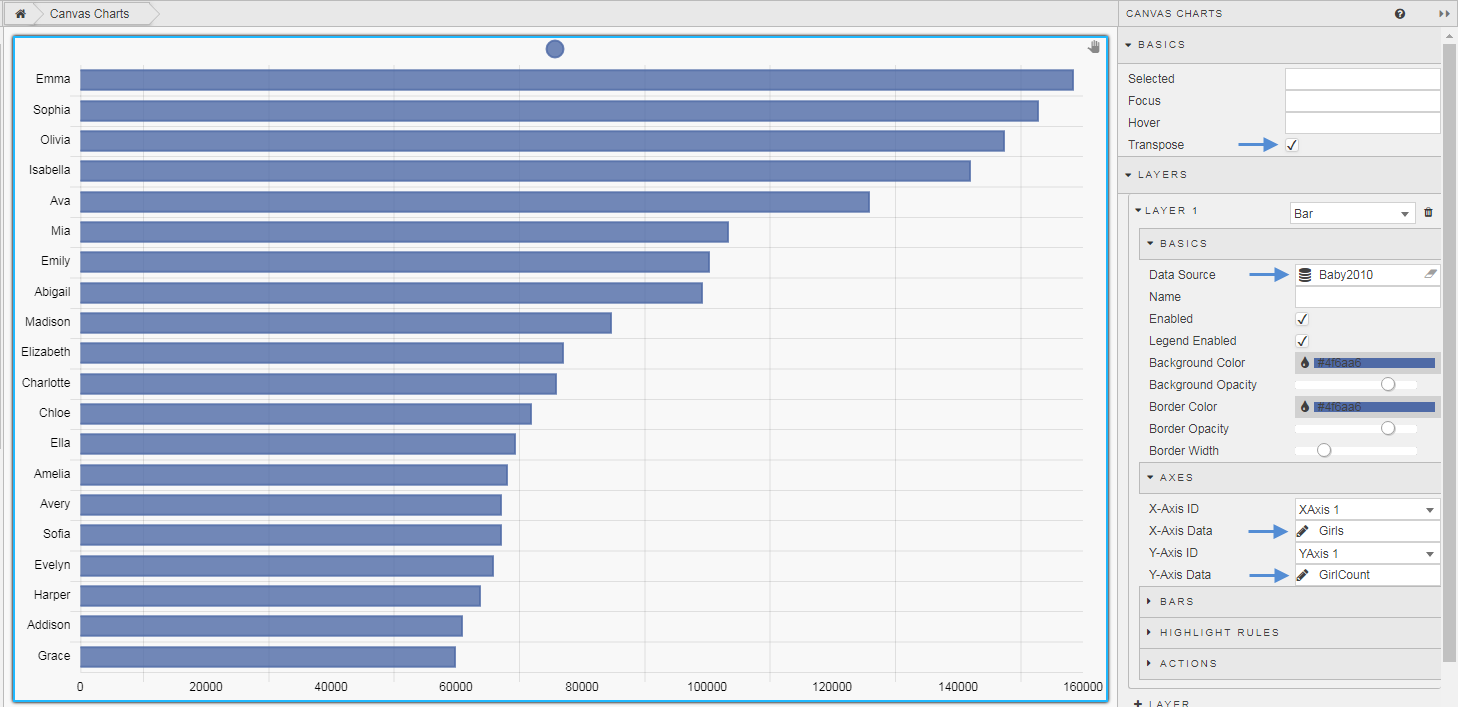
We have a chart with our first layer showing the top 20 names. We need to add a new layer for the 2000s decade and additional layers for each decade back to 1880. To do this we copy the query, and paste to create a new data source query. We can then change the input value for seldec, subtracting ten for each decade, to generate the data set for the number of babies named in that decade. For example, for the 2000 decade we have:
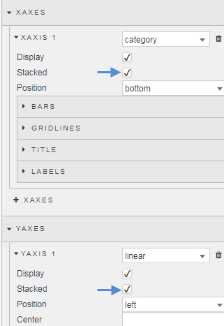
This will add a new layer to the chart. We also need to stack the bars in the chart, this is done for both the Y- and X-Axes.
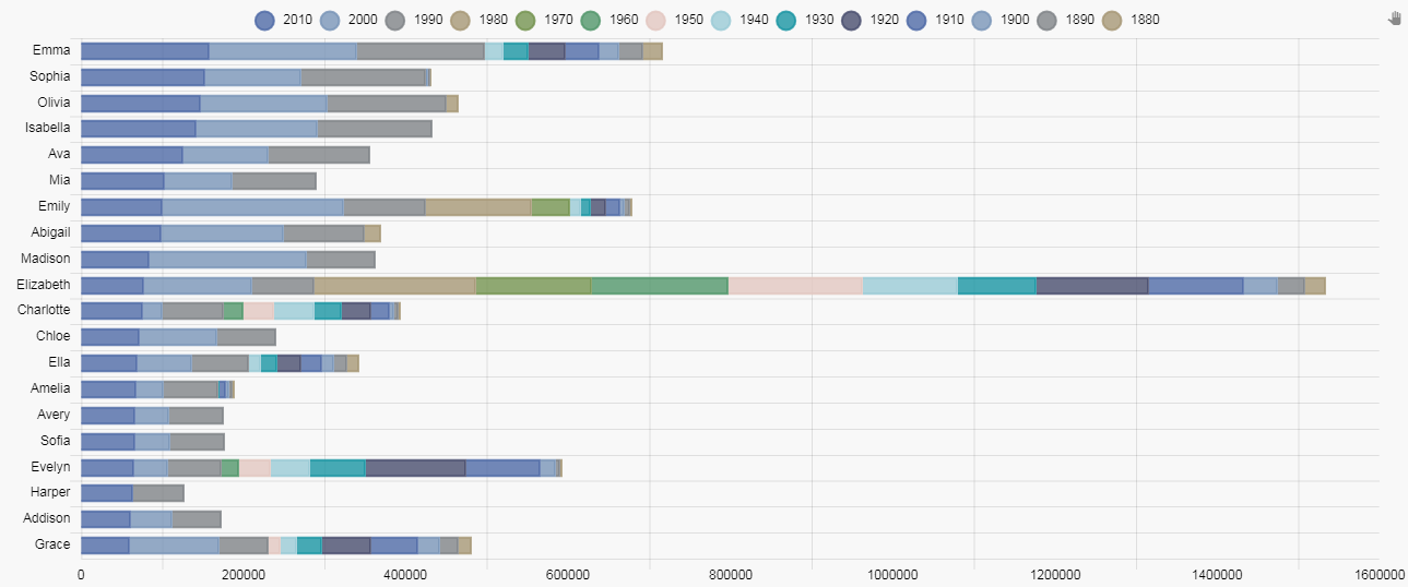
We keep on building our layers so we have a data set for our top 20 covering each decade back to 1880. This will give us something like this:
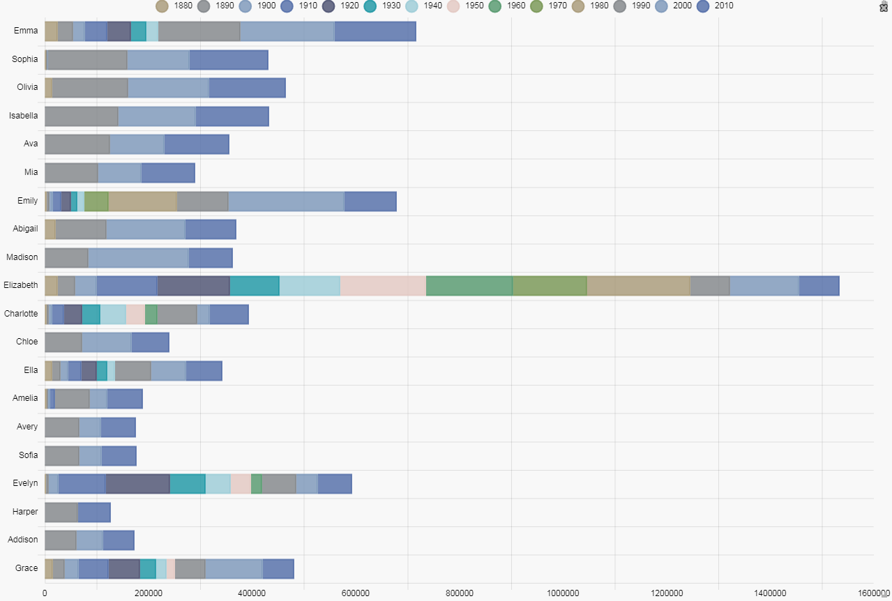
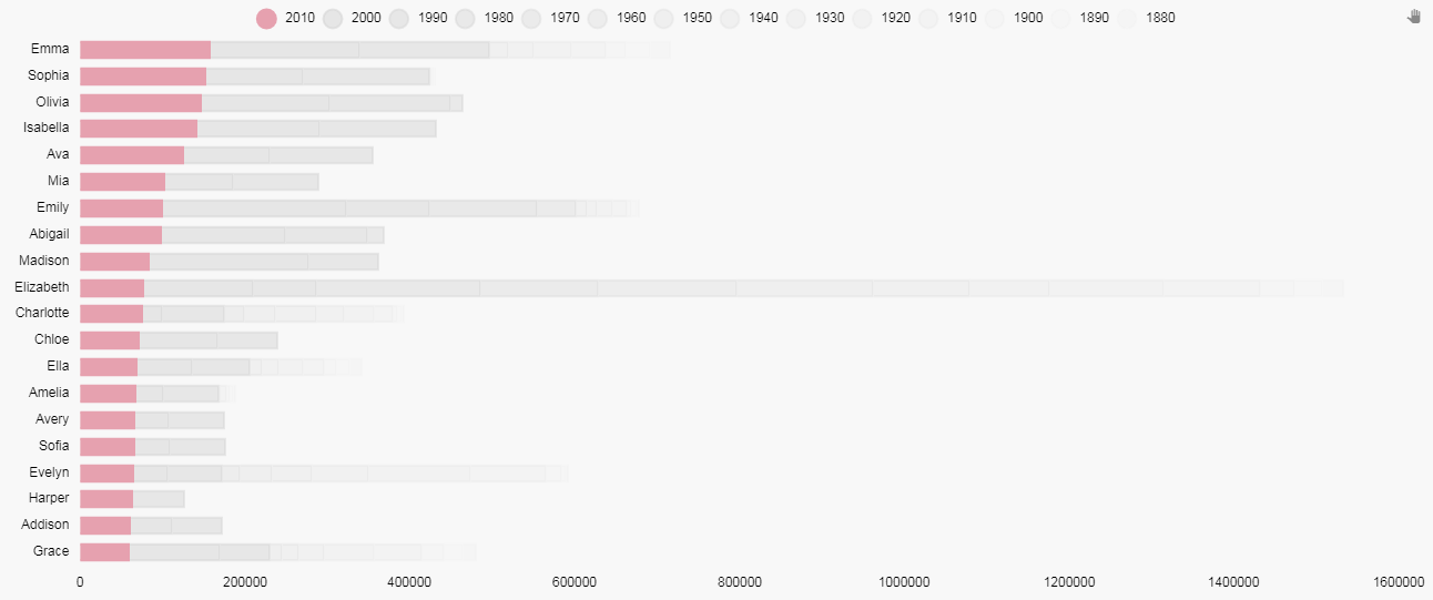
This is a quite a busy chart and is somewhat confusing, so we need to make some changes. First we have to reorder the layers so that the left-most bar is the one for number of babies named in the current decade. This can be done with a right-click-and-drag reordering of the layers; the top layer will be for 1880, moving down in sequence to the current decade, 2010.
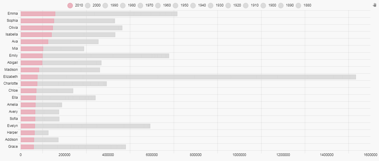
Now we can see the semblance of order for the current decade with Emma the most popular name for the current decade and Grace the least, but the chart still remains confusing with the large number of colors.
Next we are going to emphasis the left most bar in our sequence, and make all other decades a grey color.
We can use a view state parameter to assign our color code. This way we don’t have to go back to the color palette each time to select the color, and we can keep the continuity of the color.
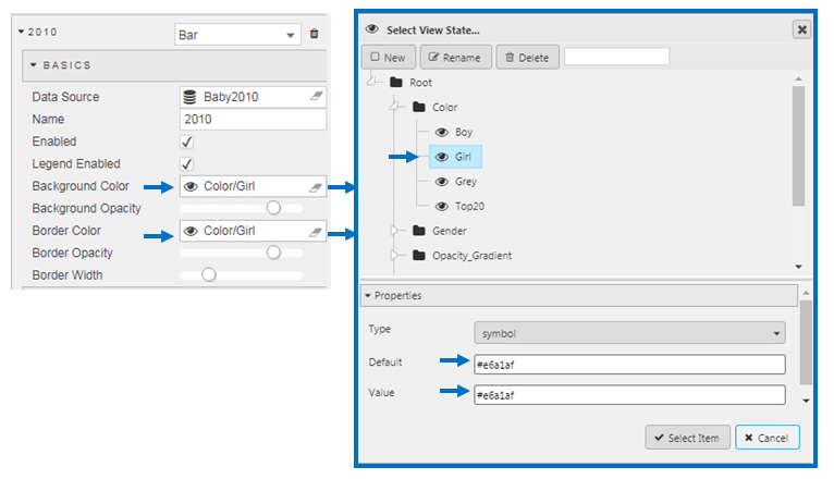
For the other decades, we will assign Background Color and Border Color to a Grey (#d3d3d3). This leaves us with:
We now have a clearer picture of the name ranking for the current decade but we need to return the differentiation for each decade. To do this, we will use opacity gradient to emphasis each of the decades from heaviest for the current decade, to lightest, the 1880s. The gradient is an integer (Type: int) between 0 to 100.
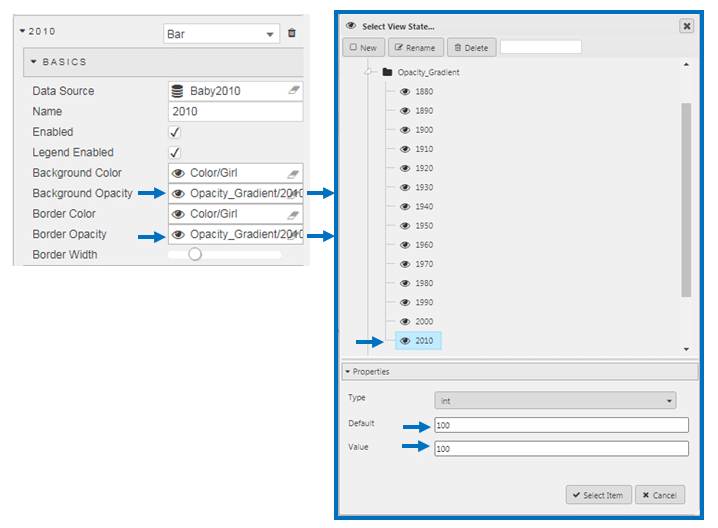
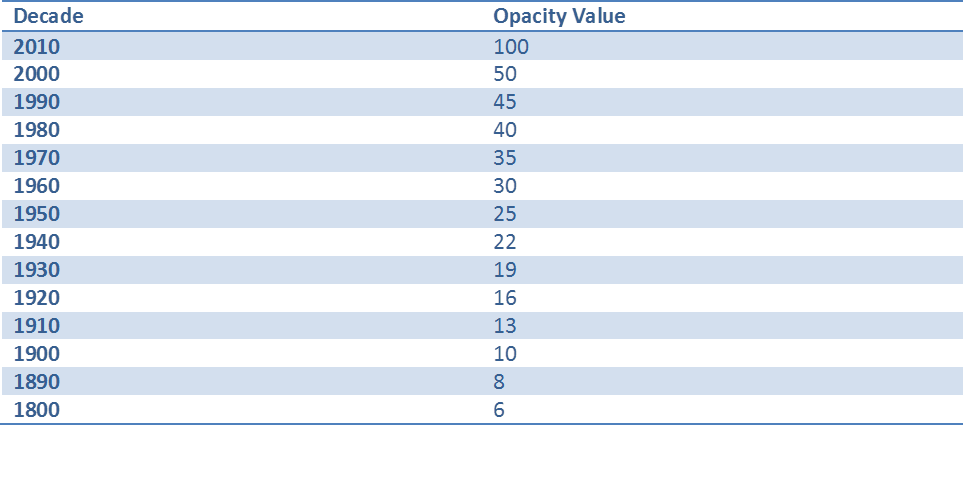
So the following gradients were applied for each decade:
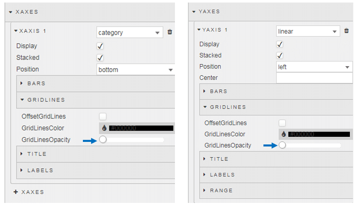
Now we have a significantly heavier emphasis on the current decade (with color) and a long tail of data. After 1950s, the grays become very light, so I have removed the gridlines by reducing their opacity to zero as these dominate a little too much.
Now we have a chart looking like this:
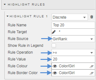
But with Dashboards we can add a little more flavor. Next we will add a color to show in previous decades if any of the 20 names appeared in the top 20 for that decade. For this, we will use a Highlight Rule for each data Layer in the chart. The highlight rule will apply a wild card search to each names ranking for that decade and apply the color to that segment of the bar where that name made the top 20. This is our rule:
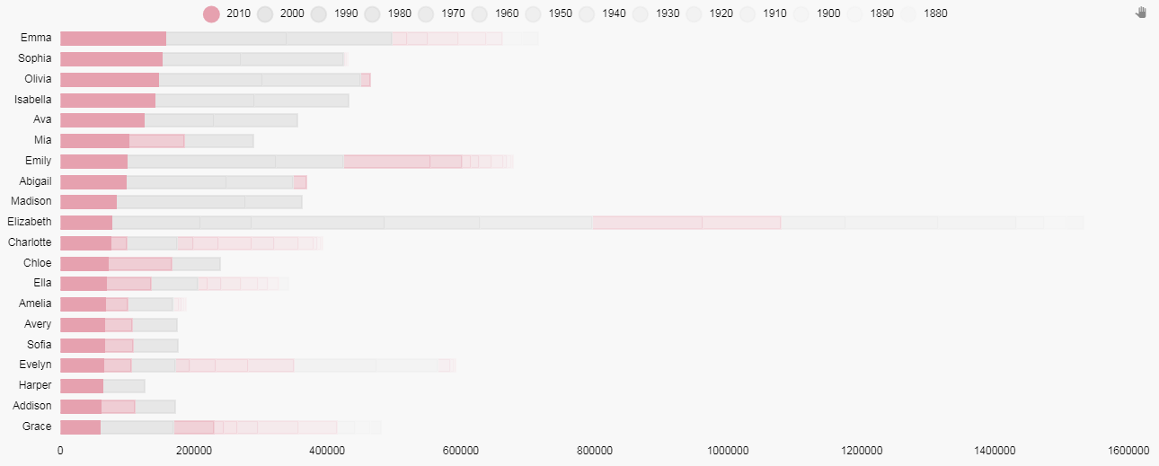
Now we have something like this:
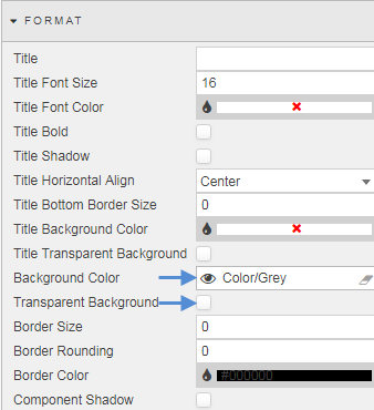
Using two Text components we can add some flavor text and a title to our chart. We will have a title text box with a gray background (the same as used in the chart)
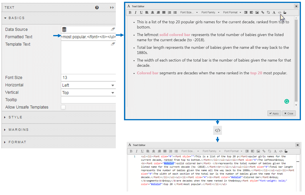
And a flavor text, where the HTML editor of the Text component is used to change the color of the highlight text to match the color of the bar chart.
Now are our chart image looks like this:
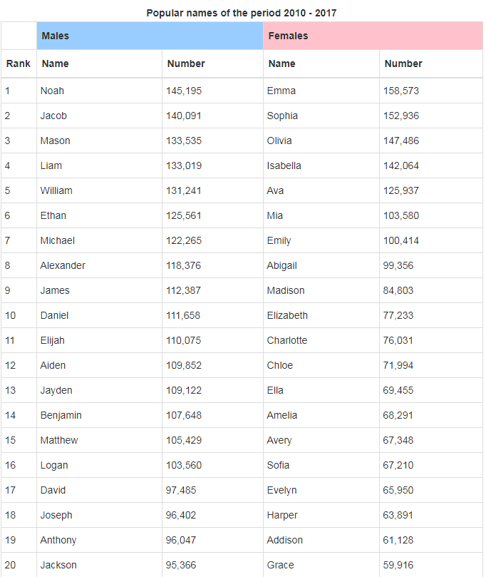
For comparison, here is the one for Top 20 Boys Names. To create this I duplicated the screen, switched the plotted data columns from Girlrank to Boyrank, and then changed the color set in our view state parameter to a blue – this single change will apply across the chart for all instances where the view state parameter is used.
Conclusions from the Data
What can information can we draw from these charts?
- Popular girls’ names cluster around a top five and then move into a long tail. Popular boys’ names tend to be more diverse.
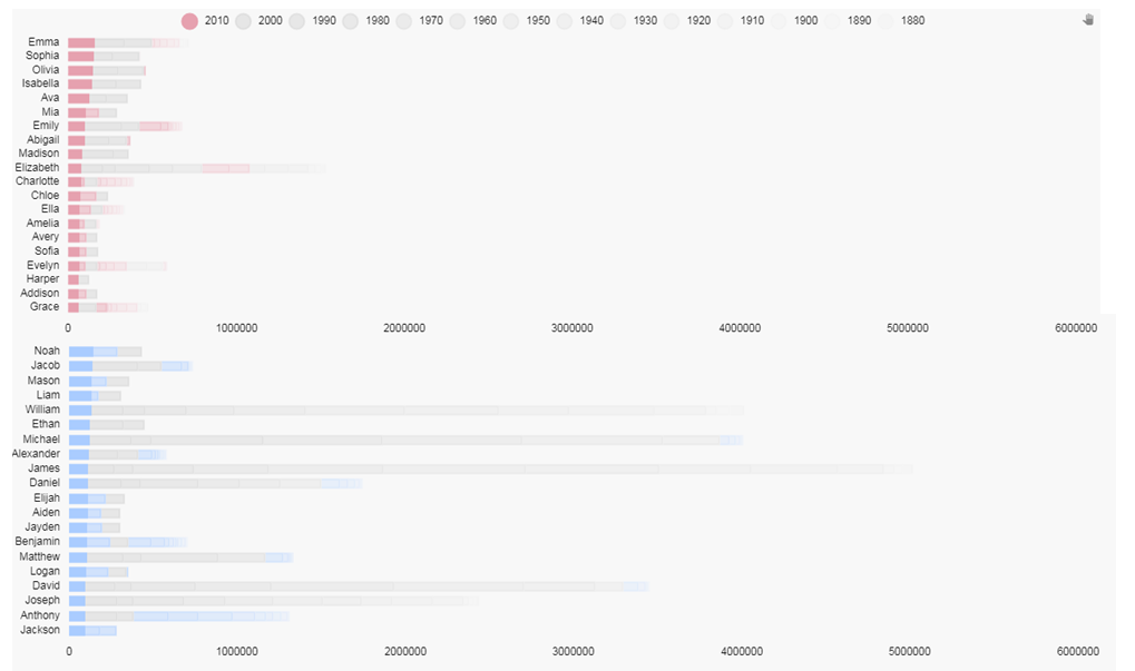
- There are more traditional boy’s names in the top 20 than girls. We can quickly do a comparison by changing the y-axis range for each chart so they match
Names like William, Michael, James, David, Joseph and Daniel have remained popular for boys throughout the decades – although not as popular as they were in earlier decades. Only Elizabeth has maintained a presence in the top 20 for girls.
Extending from this, girls names popular in the previous decade don’t necessarily stay popular in the next: in the top 10 girls names for 2010-2017 only Mia was a top 20 name in the previous decade, but for boys there was Noah, Mason and Liam.
In terms of ethnicity, we are not seeing too much diversity in baby names, particular for boys. Isabella was a top five name for girls and has emerged relatively recently on the list but the demographic shift towards minorities hasn’t fully expressed itself in baby names, yet.
[1] https://www.ssa.gov/oact/babynames/decades/names2000s.html