


By Declan Fallon
Fortnite is one of the most popular multiplayer games online. It has over 200 million registered[1] accounts, 78 million[2] (monthly) active players, and at any one time, it can have over 3 million concurrent users[3]. While the game has been generating huge interest for some time, its move into the eSports arena is still relatively recent[4]. Not surprisingly, millions of players generate large amounts of streaming data, but its visualization have received minimal attention to date beyond displaying personal rankings within the community at large. Using a technology like KX Dashboards, however, opens up the possibility of eSports arena-type events where audience members could track the performance of players in real time over dashboards projected onto big screens alongside the action.
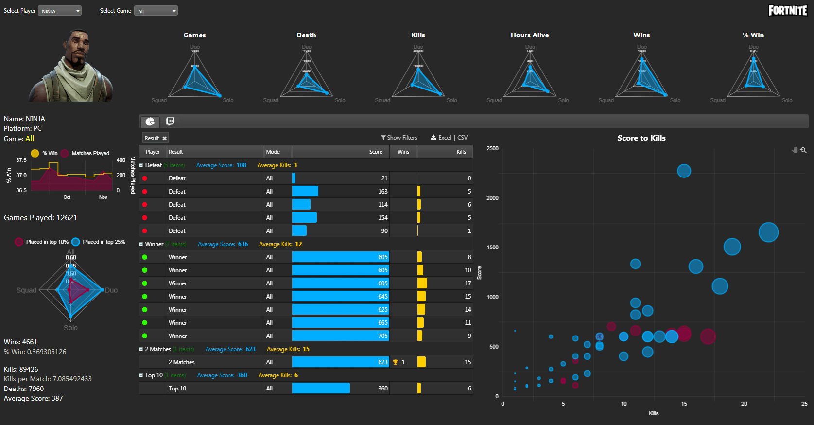
In this post we will introduce the concept of KX Dashboards templates that allow dashboard users to integrate custom content alongside kdb+ technology inside their dashboards. This is illustrated in the dashboard below using sample data on five leading Fortnite players to create a personal ranking view. Further below we explain the steps in its creation.
Deconstructing destruction
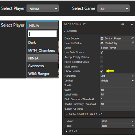
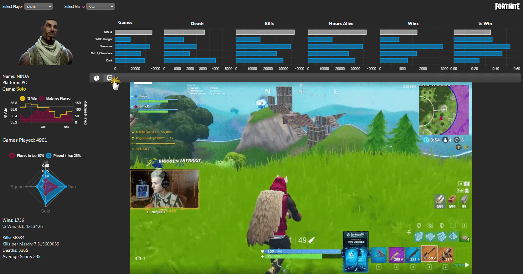
In our last article we had looked at using a Data Form to control user inputs, but in this case we will use two Dropdown components to select the player and the game type. Both dropdowns use a query to pull a list of distinct player names from the database. This ensures the dropdown component only contains a list of current players listed in the database; a Show Search option can also be implemented to make it easier to find a player, especially in a game with millions of users.
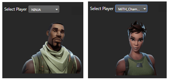
In the top right of our dashboard is the Fortnite logo, and below the dropdown selectors is a character avatar; both of these elements use a Text component to display the images.
The Fortnite logo uses a simple image upload to return the image.
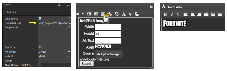
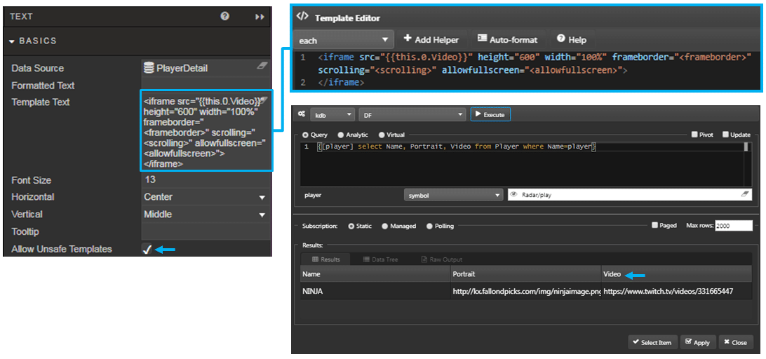
The avatar image uses a data source in combination with a template; the template includes a handlebar expression to pull data from the data source into the template. The query uses a view state parameter to reference the appropriate image for the selected player (from the dropdown component). The image URL is a data column of the query, PlayerDetail. It should be noted if reference image URLs are coming from a third-party site it may be necessary to check the Allow Unsafe Templates option to have them display inside your dashboard. This step isn’t necessary if images are hosted internally.
![]()
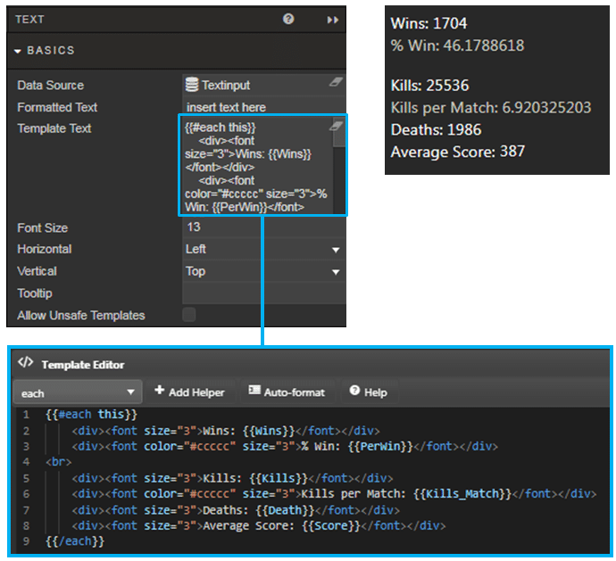
Templates are also employed to show a list of player statistics. In this example, a little HTML is added to configure the font size and text colors of the output. Again, the Text component is used to display the content.
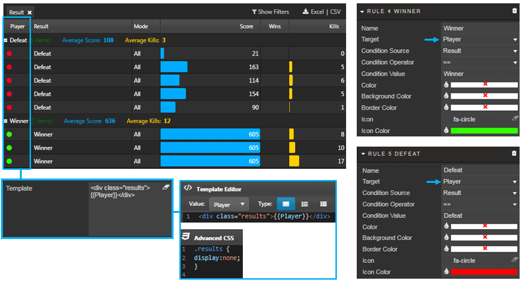
The Data Grid also employs a template to hide the text content of a cell so it can be co-opted for use by a Highlight rule. When we want to hide column data there is a check box option to hide the column from the dashboard but as we need to use the column to display our highlight rule we can use a Template alternative.
The content of the Player column has been hidden using the data column template along with some CSS (available from the data grid Style menu). Highlight rules can be set to target the Player column and populate with either red or green dot icons to denote games which resulted in victory (green) or defeat (red).
Bonus Content
This particular dashboard also uses features not previously covered in earlier articles.
Radar Charts
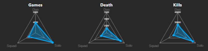
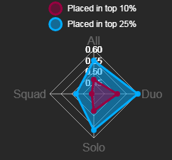
Radar charts are a good way of showing preferences; in this case, not only which of the three game formats available in Fortnite a player enjoys playing, but also how well the player does in each of them. In the above example, the player has a preference for Solo mode but the radar chart which follows shows the same player performs best (ranks in the top 10%) when they play Duo mode.
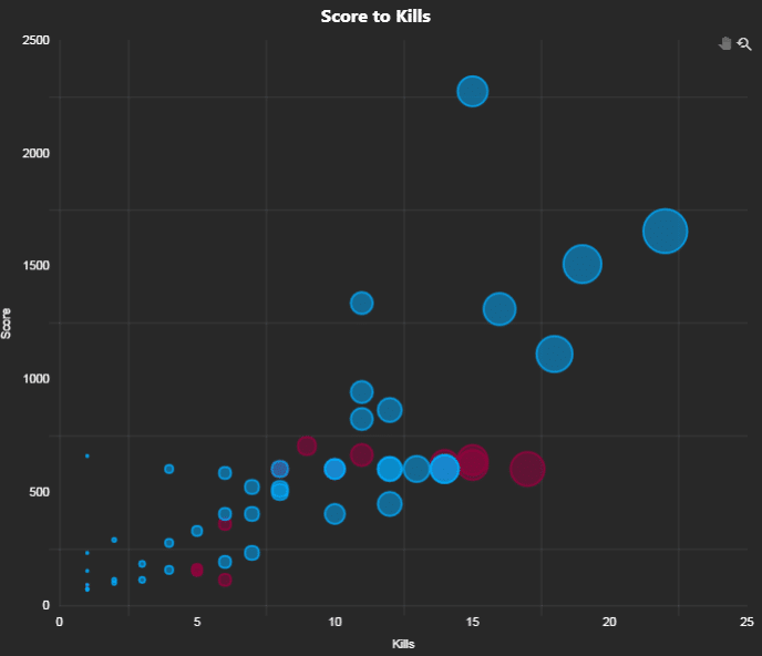
Bubble Chart
Bubble charts allow us display three variables in a single chart: x- and y-axis data and a third variable as bubble size. In our bubble chart we have plotted the player’s score from individual games against player ‘kills.’ The ‘kill’ count was also used to determine bubble size.
As we only used data for five players we can plot individual data for the last 15 games played by each player on the one chart, and then use a red highlight rule to isolate the selected player’s data – offering a quick comparison of their game performance against their peers. If there were many more than five it may be necessary to include a multi-select dropdown to select the players to include in the comparison.
Embedded Video Content
In addition to custom templates, the Text component also allows for embeddable third party-content. In the screenshot below, a Twitch stream has been added to the dashboard as part of a Tab Component
As with earlier embeds, a handlebar expression is used to reference the video URL and Allow Unsafe Templates checked to enable the display of the Twitch stream.
Fine-Tune Dashboards
KX Dashboards has been designed so that users with little technical or programming experience can quickly produce visualizations of their data. However, dashboards offer so much more in supporting customizable elements via templates using combinations of HTML, CSS and handlebar expressions. Furthermore, third-party (or company) content can be integrated into your dashboards to further enrich the final offering.
In this example, we have produced a performance dashboard for a Fortnite player, but a similar style dashboard could be used by an HR department for an employee, a sales team for a customer, or an analyst for a company.
[1] https://www.bloomberg.com/news/articles/2018-11-26/fortnite-now-has-200-million-players-up-60-from-the-last-count
[2] https://www.polygon.com/fortnite/2018/9/20/17884036/how-many-fortnite-monthly-players-2018
[3] https://www.gamesradar.com/how-many-people-play-fortnite/
[4] https://esportbet.com/fortnite-battle-royale/


