


by Declan Fallon
For our April blog, we will revisit the #SWDChallenge run by Storytelling with Data[1]. This month’s challenge is hosted by Elizabeth Ricks and looks at the concept of emulation; taking the source material, adding touches that improve the message, while maintaining the core imagery which makes the visual successful.
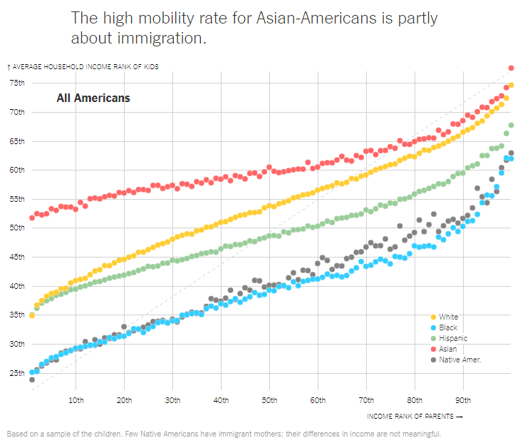
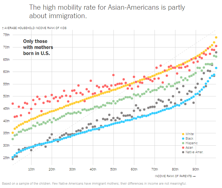
One of the best purveyors of data imagery is the New York Times. In this post we will look to replicate one of the bubble charts used to show social mobility across different racial groups in the U.S. Data is sourced from Opportunity Insights; Race and Economic Opportunity in the United States: An Intergenerational Perspective[2]
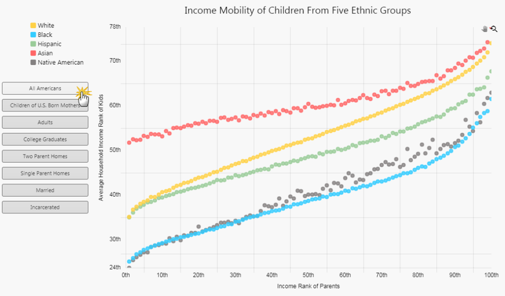
The following chart neatly shows the influence of parental birth on child income mobility.
Step 1
We want to build out a Canvas Chart which adopts the look and feel of the New York Times visual. But before we do we want to have the option to make broader use of the data set. To this benefit, we will start with a Flex Panel. The Flex Panel allows for two components to fill a defined relative width in the dashboard which scales on browser resize, useful when embedding user inputs alongside an output like a chart. For each section of the Flex Panel, we will add a Layout Panel.
Into the larger panel is added a Text and Canvas Chart component. The Text component will carry the descriptive text for the chart.
Step 2
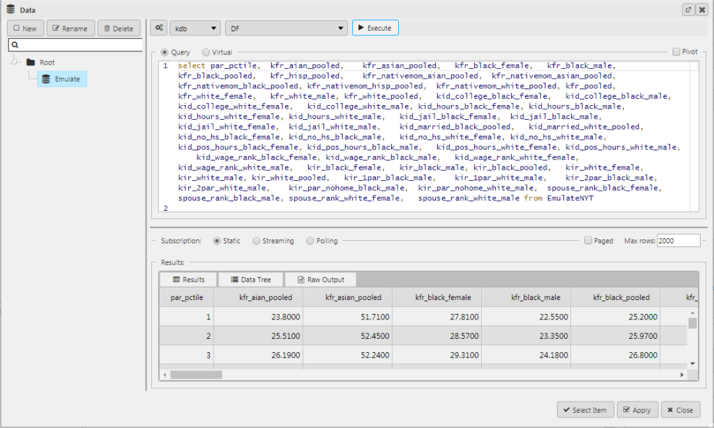
Next, we add the data to the chart. We inherit the data headings from source where it may be possible to use a wildcard (“*” ) when it comes to charting some of these elements.
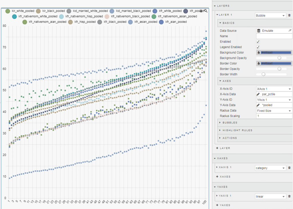
To test the wildcard output, we can go into our Canvas Chart, add a Bubble Layer and for the Y-axis Data add “*pooled” which will return the data for All Americans.
Step 3
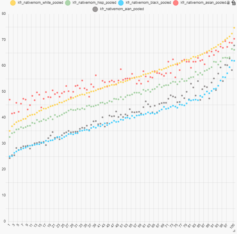
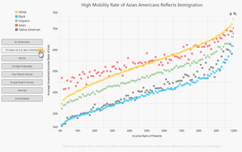
The output returned more data points than we need but you can see the benefit of the wildcard, as formatting for each plotted data series is tied to a single layer. We can use the wildcard to pull out the children born to native mothers.
This can be done using two wildcards.
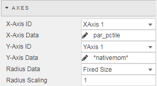
To define the color of the bubbles we use view state parameters (see Quick Visualization using KX Dashboards for more on view state parameter definitions) which we can assign to other components when color is needed. By using view states to store our colors we can maintain continuity across our dashboards.
Now we have a bubble chart which looks like this.
Step 4
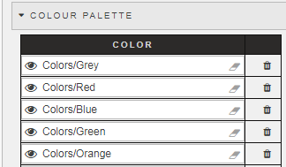
We need to clean up the x-axis and make the bubbles a little bigger. In the case of the latter there is a Radius Data and Radius Scaling setting in Axes of the Layer. The default value for Radius Scaling is “1” but we can change this to “1.7” which looks to be a closer approximation to the original.
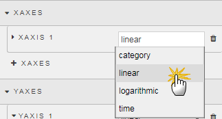
For the X-axes, we simply have to convert the type from category to linear.
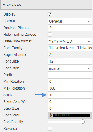
We also can add some text for both x- and y-axes to include the percentile categorization. In the Labels menu is a Suffix property; add “th” to each.
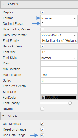
We can also want to use the data range for our Y-axes so the data better fits the chart; as part of this, we also want to set the Format to Number and Decimal Places to zero.
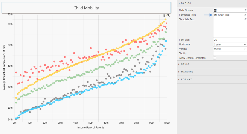
Now our chart is getting closer to the original in look.
Step 5
Next, we need to deal with the legends and labels. This is done from the Title property of Canvas Charts
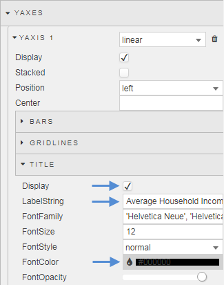
For the chart key we will use a custom Text component, added to the left section of our Flex Panel. Inside the Text component we will add some HTML to make up the code key for the chart. This is required as the wildcard usage will pull legend names from the data source, which isn’t suitable in the use case here.
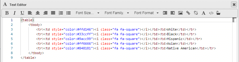
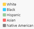
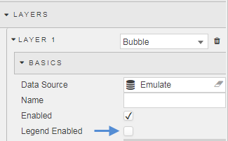
Using a custom key allows us to disable the default Canvas Chart key.
Step 6
We have a plotted data source for children with U.S. born mothers, but what of the other demographic groups? We can toggle between the different data sets using a combination of Buttons and view state parameters.
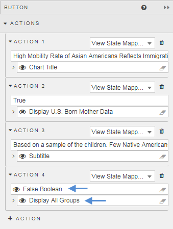
For the Button, we will have two view states: one to toggle the display of the data and a second to update the title of the chart.
We can start by giving the chart a default title. We will assign this view state parameter to a Text component positioned above the chart; the reason for using a Text component over the default Canvas Chart title is that we have a little more customization options for the formatting.
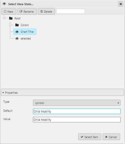
We then assign the Button under Action new content for the Chart Title and a boolean switch for the data display, set to “True” (default the switch to True by checking the default box for the view state :
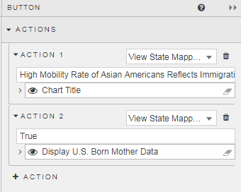
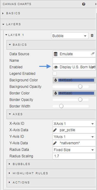
Finally, we set the display of data for children born from mothers born in the U.S. to the boolean switch in the Canvas Chart.
Step 7
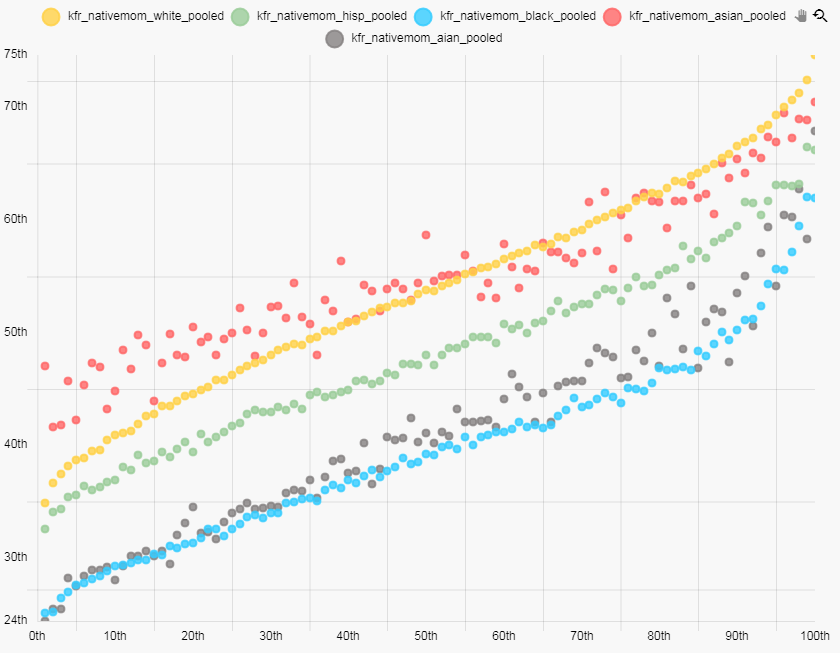
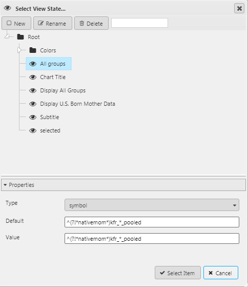
With the core steps laid out, we can build out the chart using the additional data columns. I have added a footnote Text component beneath the chart, populated by a view state in a Button action. In cases where the wildcard was not an option to display the data we instead can use a Regex expression; for example, plotting all pooled data where ‘nativemom’ is excluded from the data column header:
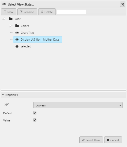
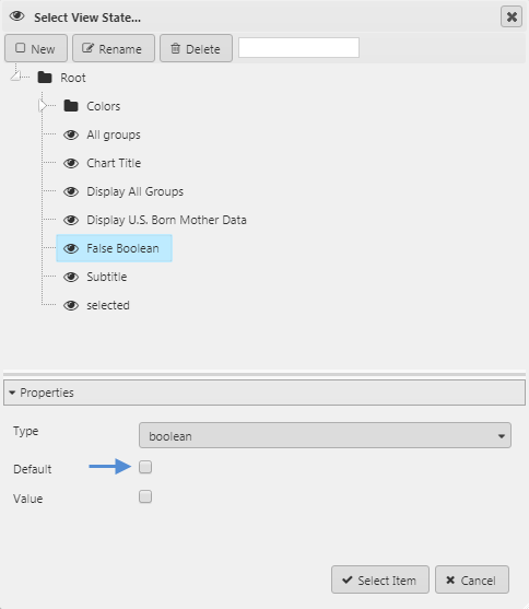
As each Button click is adding data, we also need a means to remove previous data. Again, this is done using a view state parameter. For each data layer we want to hide we assign a False Boolean switch
Final View
We now have a chart which has its own descriptive title for each metric, with a supporting footnote for any further explanation of the data:
[1] http://www.storytellingwithdata.com/blog/2019/4/1/swdchallenge-emulate
[2] https://opportunityinsights.org/data/
For more information on KX Dashboards please click on the links below


