

For our KX Dashboards blog post we will look at bullet charts. Bullet graphs are the topic for this month’s #SWDChallenge so it’s a good opportunity to showcase KX Dashboard’s capabilities for building your own bullet graphs on the platform. Bullet graphs are not a default option in Dashboards, but we can use the flexibility of Canvas Charts to build an example by modifying the existing bar chart. If you haven’t already, grab a copy of Dashboards Direct so you can follow along.
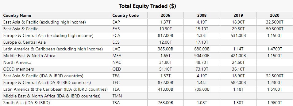
The data we are using is country comparison data of stock trading volumes to domestic market capitalization. This data is available for free from the World Bank. To import data into Dashboards Direct, you can watch this video – the process is very quick, and easy, and you can be using your own data in minutes.
What is a Bullet Graph?
Bullet graphs were created by Stephen Few1 with the purpose to replace gauges and meters, which frequently took too much space in a dashboard and themselves were often confusing in meaning. The graph features a primary measure compared to a secondary value which enhances its context and can include a target level. A qualitative performance – often differentiated by different hues, for example between poor, satisfactory or good – can also be part of the graph.
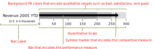
Image Source – Wikipedia
How can we build a bullet graph in Dashboards
We are going to build a simple example of a bullet graph from World Bank data.
- Click-and-drag a Canvas Chart into the workspace
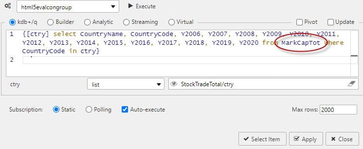
- Start with the initial Layer – Basics – Data Source, we will add a query which will filter results by world regions. The underlying data we are going to use the Total Value of Stock Traded for the year in US Dollars: StockTradeTotal
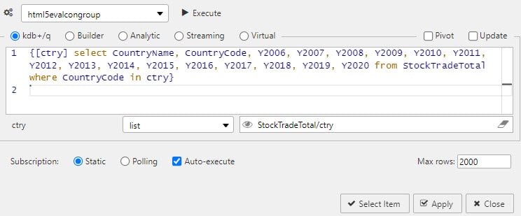
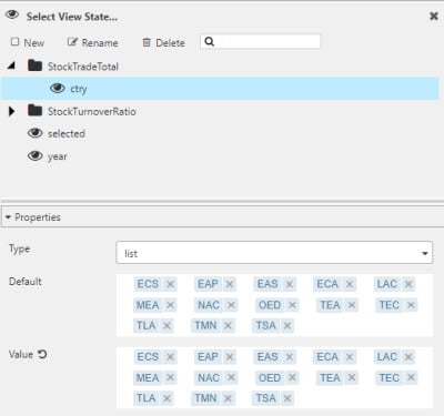
This query includes a view state parameter for country/region (ctry) which we have defined as a type list, using the World Bank tags for economy groupings2 which are part of the data set.
- With the data source assigned, we can then define the chart type: Bar, and the Axes data to plot, which for us will be Country Name vs 2006 data; 2006 was selected as it marked the year prior to the collapse in global financial markets from the credit crisis.
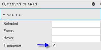
- Next, we are going to make the chart a horizontal one by enabling Transpose from Canvas Charts Basics Horizontal charts are easier to read when you have long named axis categories, as we do here.
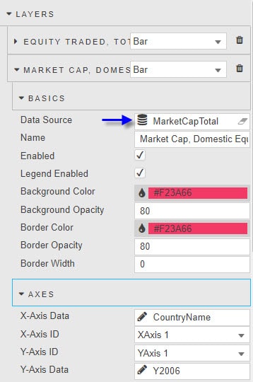
- We then add a second bar chart. This we do by adding a second Layer to a chart. For the second layer, we are going to use Market Cap of Domestic Equities in US Dollar. So we will compare the total trade volume of equities for each region against the total equity value of public companies domiciled in that region, by year, as reported by the World Bank.
We can continue to use the same view state for ctry to generate the required data, so this can remain unchanged.
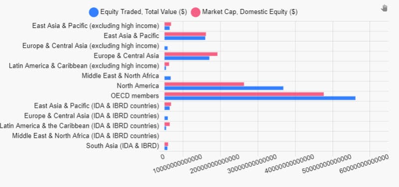
- We can give each Layer a name which represents the data plotted; so we have Equity Traded, Total Value ($) and Market Cap, Domestic Equity ($). This will have our chart looking like this

- Now we need to convert it to a bullet graph style. We start by stacking the chart on the x axes.
- Then we adjust the width of the bars of the second Layer. We can reduce the Layers – Bars – Category Percentage from 80 to 40
- We can do some tidy up of the axis to optimize the large number labels, for this we can enable the Smart Number format in YAxes – Labels – Format
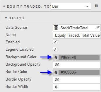
- We can then neutralize our colors a little to a grey tone. Bar colors are defined in the Layers – Basics – Background/Border Color.
This will give us a graph like this:
For the World Bank data set we have, this is as much information as we can add to the Bullet Graph. If we wanted to include a qualitative element to the chart, then by using Layers for each qualitative data column (e.g. poor, satisfactory and good), and changing the Layers – Basics – Background Opacity, we could have a stacked chart showing hue changes for each qualitative factor.
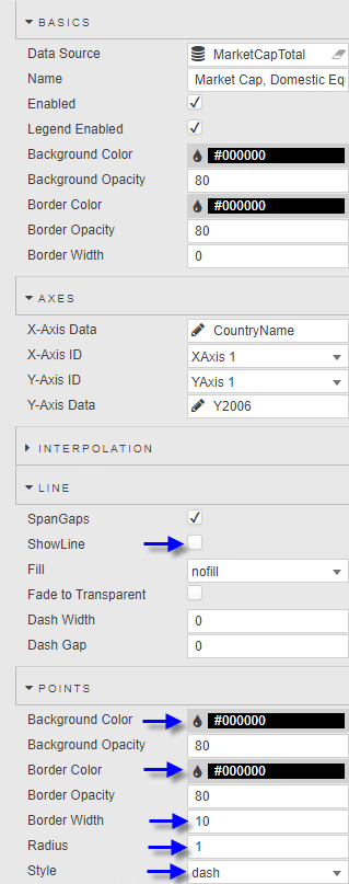
As for a target level, this can be achieved by adding a Line type Layer. Uncheck Line – ShowLine. And in Layer – Points – Radius, set the value to 1, change Layer – Points – Style to dash, and set the Layer – Points – Border Width to a value to match the desired width of the dash line. In our example I will use the Domestic Market capitalization of equities from 2006 to offer context going forward. Bullet Charts
What does the data say?
The World Bank data set goes back to 1960, but if we were to pick certain years of data we can examine snapshots of what global markets looked like at any given point in time.
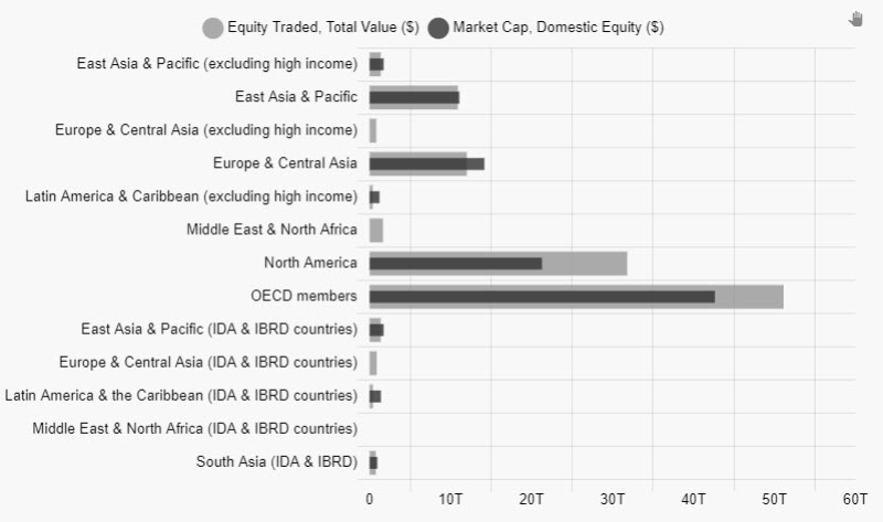
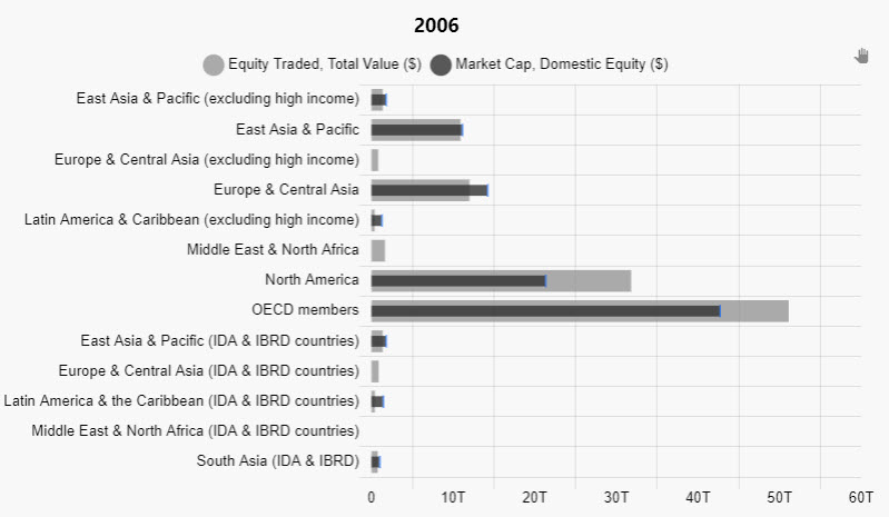
2006
The data shows how global equity trading volumes were focused on wealthier APAC, Europe and North America regions. The bulk of global equity trading volume was done on North American (USA) exchanges.
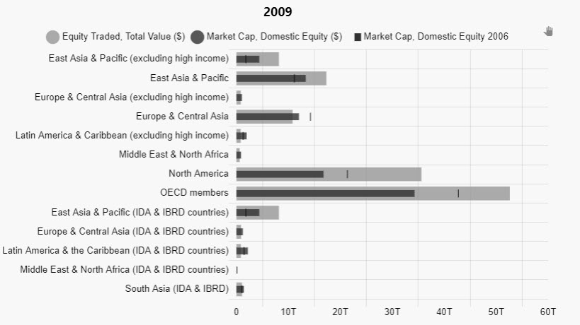
2009
At the nadir of the credit crisis, we can see the impact on equity valuations in comparison to 2006. OECD Members took the greatest hit, but there was an actual rise in market capitalization of domestic Asian and Pacific region equities across the income spectrum – not just wealthy nations in the region. This likely helped drive the increased trading volumes in these areas too.
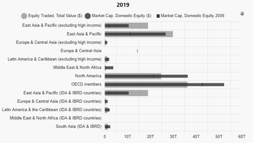
2019
In more recent times, we continue to see strong growth in East Asia and Pacific regions, but we also see how the growth of the Tech giants has nearly tripled the domestic market capitalization in North America as trading volumes fall by a third from where they were in 2009. Not only that, trading volumes are nearly comparable to totals in non-wealthy East Asia and Pacific nations. Unfortunately, there was no data for Europe for 2019.
Together, we can see how bullet graphs help tell a story. Unfortunately, World Bank data was limited for Africa. And outside of the aforementioned regions, trading volumes and domestic market capitalization of companies was just a tiny fraction of the dominant regions.
Why not see what KX Dashboards can do for your data? Download today.
References
[1] https://en.wikipedia.org/wiki/Bullet_graph
[2] https://www.ilae.org/files/dmfile/World-Bank-list-of-economies-2020_09-1.pdf