By Declan Fallon
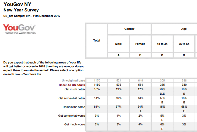
For this article we will look at the annual ritual of New Year resolutions. YouGov[1] ran a poll which asked a series questions on participant’s outlook for 2017 and categorized their answers by different social groups. Unfortunately, the tabulated presentation of the data made it difficult to draw conclusions; so here, we will use Kx Dashboards to look for interesting aspects from the data.
The Basics
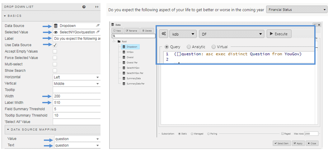
The first thing is to get our data into a table with a simple filter option. This was outlined in our “Choices and more Choices” article. There are six core questions which we will define as a dropdown selection, tied to a view state parameter, with the results displayed inside a Data Grid
Stage I Update
The questionnaire uses a number of different categories to breakdown the answers. In the PDF, this is spread over 22 pages but we can give an overall snapshot by:
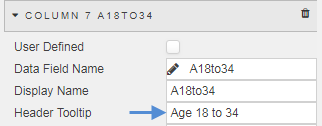
- Narrowing the columns and using a Header Tooltip to represent the column names
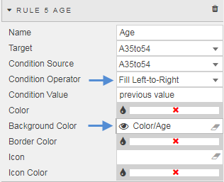
- We can use a left-to-right Highlight Rule to represent data values, shifting the emphasis from columns of numbers to a relative graphical comparison. To achieve this, I have hidden the values from the column and emphasized the values by representing each set of column values relative to the maximum value for that column. We can universally apply a style to our columns using a mix of Template and CSS as outlined in my last post.
For example, the Total column values were converted to a percentage with:
(Total%(max Total))*100
This could be repeated for each column
- Then, we can group the different demographic groups using colors, applied using view state parameters as done in my first article.
At this stage, we have something which looks like this:
Stage 2 Enhance
The Data Grid still looks ‘too busy’ with the number of columns, particularly trying to discern what each column represents. Next, we will parse out the demographic elements with a second dropdown and tie the output to a set of Data Grids embedded in a Tab component.
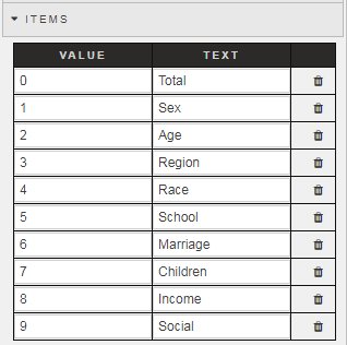
- Add a second dropdown, and configure create a row item for each demographic category. Note, we are going to use a view state parameter to determine which tab is opened. This requires a value assignment from 0 (for tab 1) to n+1 for each subsequent tab.
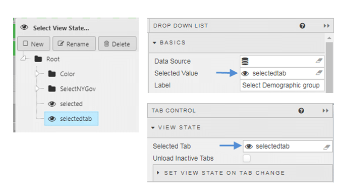
- We then create a view state parameter to link the Dropdown component to the Tab
- Inside the Tab Component we can add a Data Grid, but before we do we can add a Layout panel; layout panels allow us to create mini-dashboards within tabs and accordion components. We can adapt our data source to include both the percentile value and the relative-to-maximum percentile value; this way we can use the highlight rule (hidden to the user) while displaying the true percentile cell value to the user.
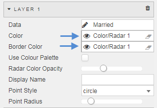
- We can add a further visual with a Radar chart. With the radar chart we can add a layer for each demographic group and color code accordingly (again, using view state parameters for our colors).
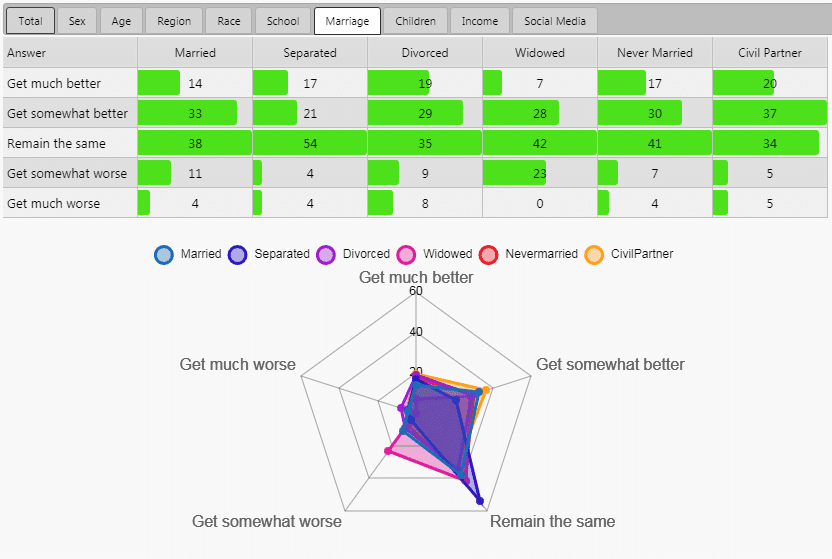
Within our Tab component we now have a more defined focus on the demographic and their responses.
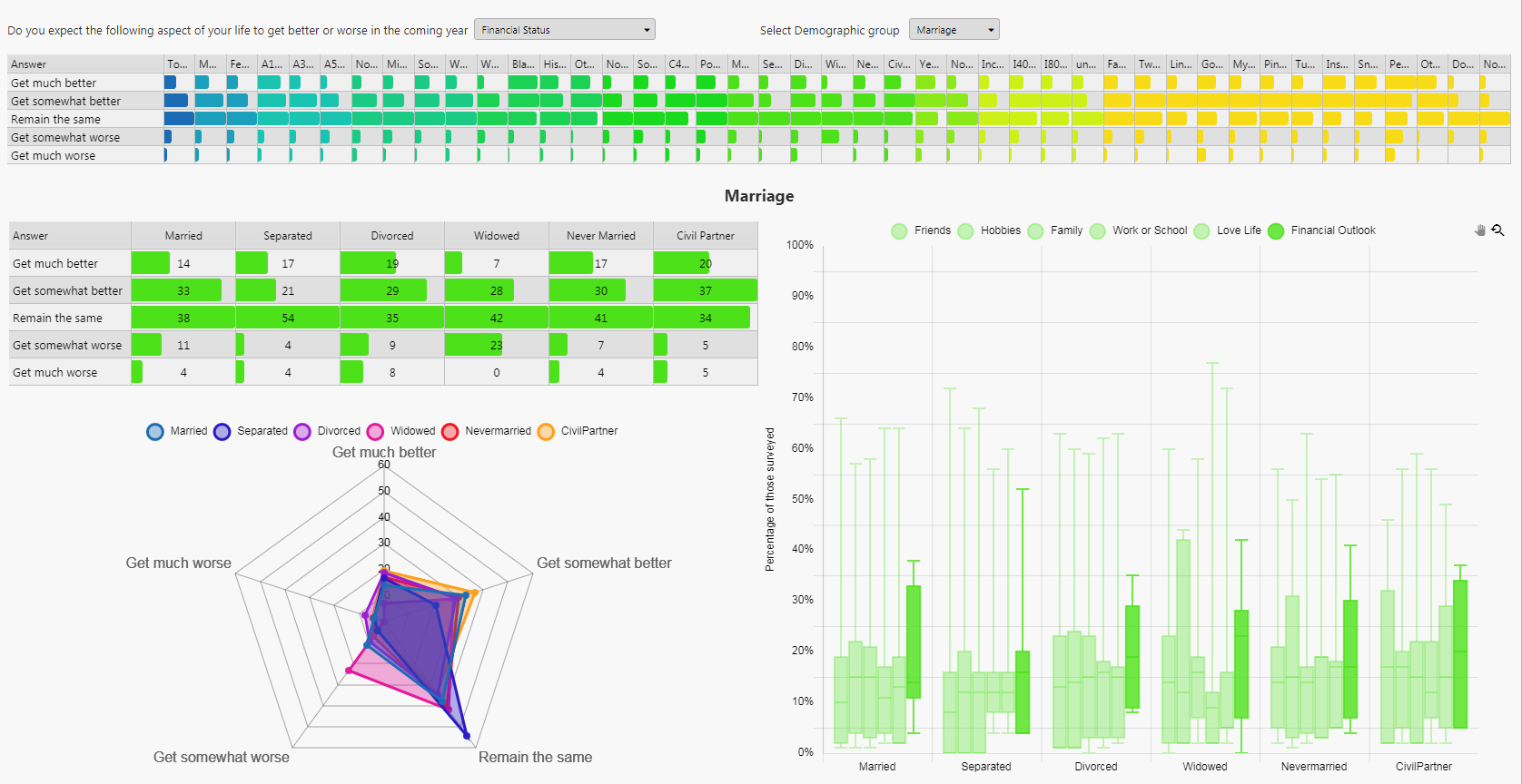
For example, in relation to the question around people’s financial well-being for the New Year, factored by marriage status, we can see the largest distribution in responses (from “get much better” to “get much worse”) coming from divorced couples, no doubt contingent on which side of the settlement award the responder fell on. Not surprisingly, the most negative in outlook were widowed as their outlook would no doubt be impacted by the loss of a partner; the radar chart for the widowed shows a marked skew in favor of “Get somewhat worse” on the financial front. The most optimistic were Civil Partners, the only group where “Get somewhat better” was the dominant answer. Married couples were also relatively positive. Separated people were the most neutral in their outlook; an attitude in sync with their married status limbo.
Stage 3: Extra kicker
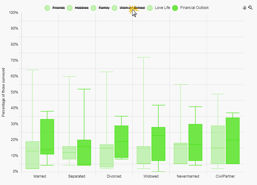
The radar chart is an ideal chart to use for this format of comparative analysis. We can add a Canvas chart to give us a representation of the distribution of answers; we will use a Box Plot to demonstrate this.
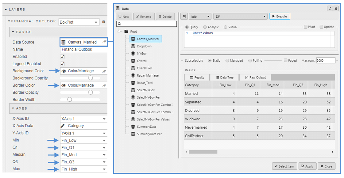
- The Box Plot is constructed using a quantile distribution. Each level is a defined column in your data source.
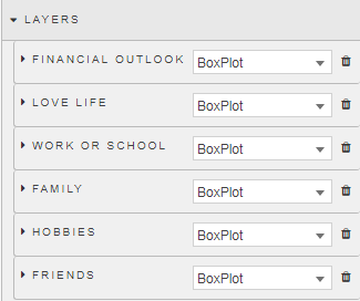
- We can add a Layer for each question answered, so we have six layers:
We do this so in the chart, users can select which of the provided data layers they want to view when making comparisons. For example, the range of answers given (from ‘Get much better’ to ‘Get much worse’), there was a wider distribution of answers when opinions on financial outlook for the year was asked compared to those of the participant’s love life.
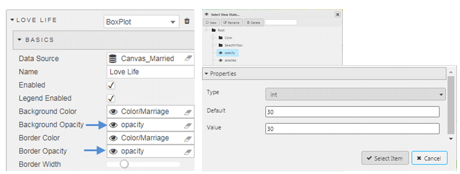
- To highlight the featured question I have lightened the opacity of other responses with a view state parameter.
Stage 4 Nip and Tuck
At this stage, we have in place the core details of dashboard. We can finish it off by doing the following:
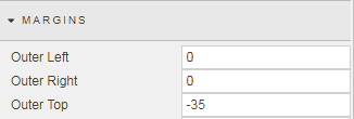
- I’m using the dropdown menu to select the demographic group, so I hid the Tab component selector. To do this, apply a negative margin to the Tab component. Removing this would be a matter of personal preference.
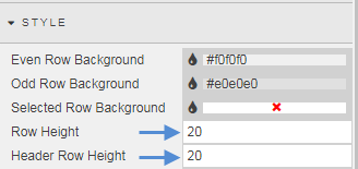
- I narrowed the row height in the top Data Grid as this grid is just a guide as to which demographic group to investigate.
- I added a Text component to give the investigative section a title to match the demographic group selected
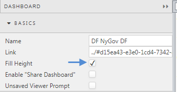
- Finally I checked Fill Height so my dashboard autosizes to the available height of the browser
The Result
In the end, we converted our plain-tabled PDF into a more interactive dashboard
[1] Survey by YouGov plc market research
For more information on Kx Dashboards and its functionality please click on the links below.


