by Declan Fallon
Cole Nussbaumer Knaflic highlights the importance of presenting data in a manner which best expresses what the data is saying. Unfortunately, many don’t step beyond the standard tabulation, but with a little more effort, other options are available. Kx Dashboards makes this process easy.
The October #SWDchallenge was to improve the following table:
We can start by applying improvement using existing Data Grid Property formats; for example, changing column names, applying numeric formats, standardizing the alignment and column widths. The Multi-Column Editor allows us to do this all at once, across columns. With that, we quickly get to:
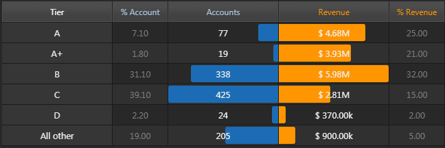
With Highlight Rules, CSS and template formats, we can also do:
Kx Dashboards Highlight Rules are typically used to show a change in an underlying value, using a font color change or appearance of an up/down arrow to mark the update, but they can also be used to apply colored bars – mimicking a chart effect within a table – based on a selected column in the table.
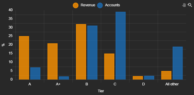
But the best results come from visualizing the data with a chart. Canvas Chart is the core charting application of Kx Dashboards and we can quickly change between views from a single chart. We could do a relative comparison with a simple bar chart
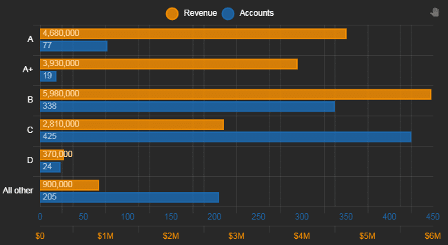
Or we could transpose the chart, add a second axis so the independent values for Revenue and Accounts can be charted alongside each other, while retaining a relative relationship between the bars.
What bar charts neatly show is how fewer than 100 accounts ranked A and A+ are responsible for nearly half of all revenue, while at the same time, Tier C clients contribute relatively little in the way of revenue but are likely a major resource drain given the high number of accounts.
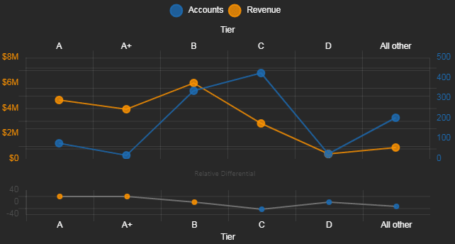
The trend towards lower revenue can be displayed with a line chart. Revenue marks a clear decline from Tier B clients. Charting the relative differential between % Account and % Revenue shows how revenue is dominant for Tier A, A+ and B accounts, but this is no longer the case for Tier C, D and All Other rated accounts.
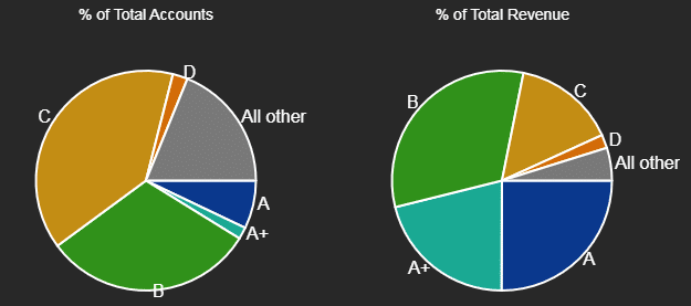
While a line chart is good for showing trend, it’s less useful for visualizing the degree of importance between categories. A better way show the relative importance of dependent variables between categories is to use a Pie Chart.
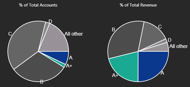
While a pie chart shows the relative importance of Tier A and A+ accounts in contributing to revenue compared to the more numerous Tier B and C accounts, it doesn’t do this in a manner which makes it easy to differentiate. However, we could do this by adjusting the colors used.
But this comes across as artificial and wouldn’t be adaptable if other rated accounts saw revenue improvements.
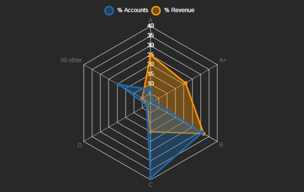
The Radar charts merge the best aspects of a bar and line chart into a single visualization. We can see from the fill area how important Tier A and A+ accounts are in contributing to revenue, but also how revenues fall precipitously for the more numerous, lower rated accounts.
Starting with a simple table, we can see how Kx Dashboards offers numerous ways to visualize data, both from within the table and with the charting opportunities available.


