by Declan Fallon
For this month’s blog post we will delve into the mysteries of technical analysis of financial markets. KX Dashboards come with two built-in financial charting packages which can be used to demonstrate technical analysis. In this article we will use the Financial Chart component. Our next article will look at some of the tools in ChartIQ.
The Financial Chart component is a free-to-use financial asset charting application. It offers 32 technical indicators and user-controlled chart overlays and draw tools; support is offered to 1-minute granularity.
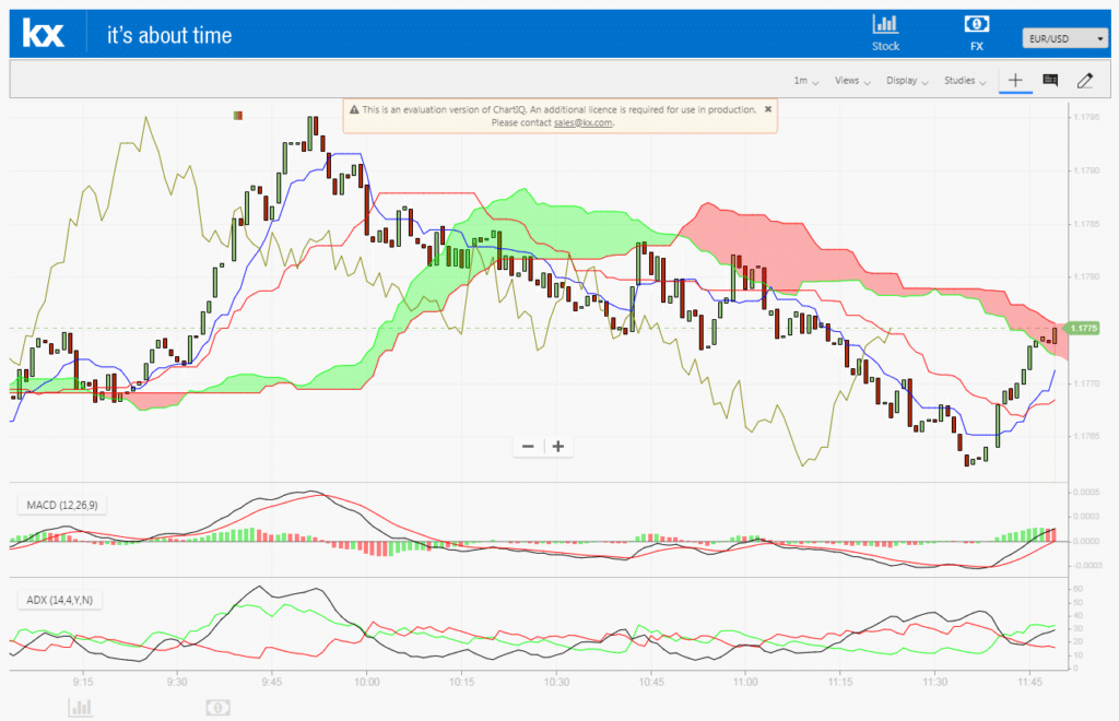
The second component, ChartIQ, embeds the chart offered by third party financial charting experts, ChartIQ. This is a per user, licensed product with over 100 technical indicators, draw tools and overlays. Support is also offered to 1-minute granularity.
Data
The data we will use is for the S&P and was sourced from Yahoo Finance. As a public disclosure, the purpose of this article is to explain technical analysis and should not be construed as investment advice!
Step 1
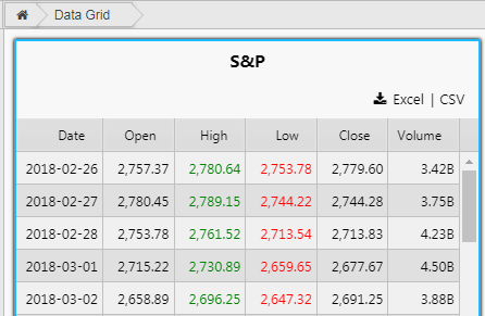
We will start by loading in one-year of historic price action into a Data Grid. The column formats for the data are Date, Open, High, Low, Close and Volume and these are required for the Financial Chart.
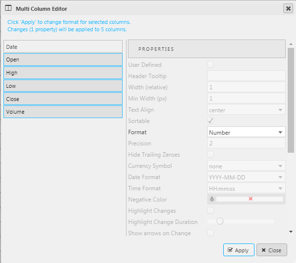
In the Data Grid, we set the value columns to two digits, and use the smart number on Volume. This can be done using the Multi-column editor.
We can differentiate the High and Low price columns by changing the font color using the Template of Data Grid columns.
I have added a Title from the Format menu. The title can be a View State Parameter so the label changes if a different index or stock is selected, e.g. if connected to a dropdown select.
Step 2
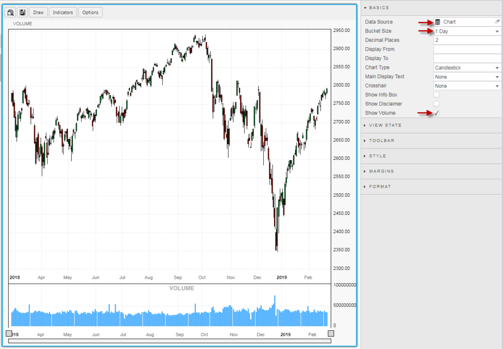
Add a Financial Chart component and assign the Data Source. The Financial Chart component automatically parses the data columns, so column names used in the Data Source must be in the format Open, High, Low, Close and Volume (and similarly capitalized). Switch the Bucket Size to 1 Day, and enable Show Volume. The default view is for a Candlestick chart, a chart which uses the Open, High, Low and Close price to construct a price ”candle” for the time period (in this case, a day).
Financial Chart also has a zoom drag bar to allow users focus in on an area of the data. The drag bar is located below the x-axis.
So, what is Technical Analysis?
Technical Analysis is the forecasting of future price movements based on the examination of past price movements and can act on any instrument where price is influenced by the forces of supply and demand.
How does Dashboards for KX handle Technical Analysis?
Both the Financial Chart and ChartIQ components offer a suite of price overlays which help measure supply and demand in the market. These overlays, often referred to as technical indicators, can assist the reader in defining the trend of the underlying price instrument; ‘bullish’ if prices are rising and ‘bearish’ if prices are falling.
Technical indicators come in three flavors:
- Indicators which measure trend
- Indicators which measure momentum
- Indicators which measure volume behaviour
Trend
The simplest trend measure is the moving average. Moving averages can cover any lookback period the user wants but the most common are average price over the last 20, 50 or 200 days. When the moving average value is rising, price action is bullish and when the moving average price is falling, price action is bearish. When moving average is flat, price action is consolidating or “range bound”. Traders often talk about “buying the pullback” or “selling the bounce”; when traders do this they are often using a moving average to determine when they buy (when price moves down to a rising/bullish moving average) or sell (when price rises to meet a falling/bearish moving average).
Momentum
When moving averages are flat or lacking direction, traders will instead turn to momentum measures to help guide their trades. Markets spend more time trendless than trending, so momentum indicators are an important tool for traders. The most common are the Relative Strength Indicator and Stochastics. The chief characteristic of a momentum indicator is its oscillation between defined boundaries, typically 0 and 100. For such an indicator, when it has a value over 70 it’s termed “overbought” and when it has a value below 30 it’s termed “oversold”. When an asset drops out of an overbought condition it’s sold, and when it rises out of an oversold condition it’s bought.
Volume
The last group of indicators measure volume behaviour, usually with some price factor involved too. For example, On-Balance-Volume is an indicator which adds up all the volume for price periods when the asset finished higher, and subtracts from this the volume for price periods when the asset closed lower (relative to the previous price, which is usually the previous day). This line moves either up, showing more buyers than sellers, known as “accumulation” or moves down, showing more sellers than buyers, known as “distribution”. On-Balance-Volume is often smoothed with a moving average to help identify its trend – as we can do with price.
Divergence
Divergence is a concept when price does one thing (trends higher) while one or more supporting technical indicators does another (moves lower). A divergence is a potential sign for a reversal in price and helps prepare traders their buy and sell cues.
Keep it Simple
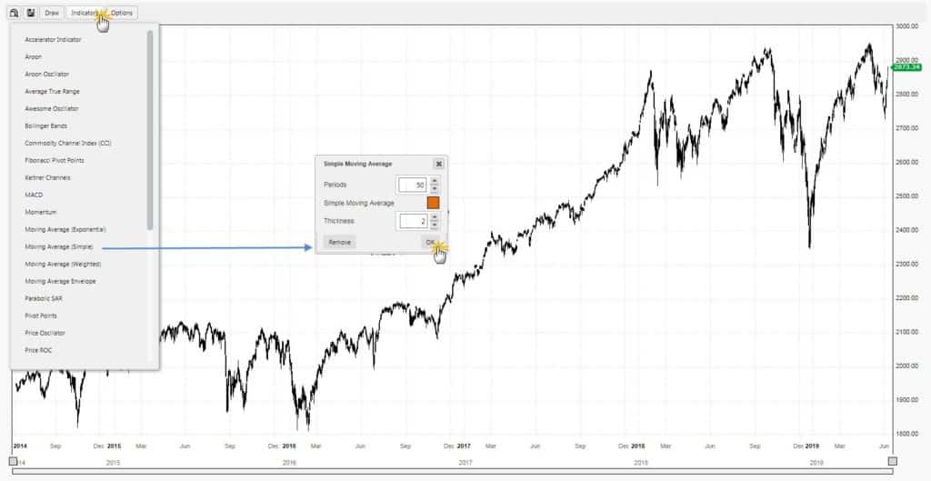
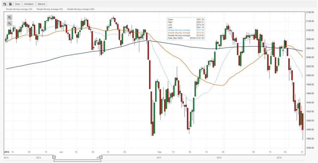
As our first use case, we will use the Financial Chart component to overlay three trend indicators: a 20-day, 50-day and 200-day moving average. This setup is one of the simplest traders can use.
In Preview Mode we can add our overlays and configure their settings.
What’s in a Chart?
Year 2015
2015 was not a great year for the S&P. Crude oil prices took a dive, and this had a knock-on effect on the prices of other assets, including stocks. In the chart, we see this action with frequent crossovers in our three moving averages; when markets trend, moving averages align in the direction of trend, but when there are doubts, moving averages muddy an already messy chart. This is not a market traders relish working in.
Year 2016
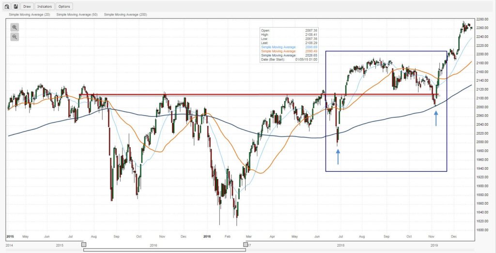
President Trump is elected, and Traders find some confidence. But before we get to that we have what’s termed a “swing low” in early 2016, which later marks a market bottom and the start of a new rally. With the chart, we have the benefit of hindsight. Traders aren’t to know in January or March 2016 that a “swing low” is happening, in fact, up to mid-February it all looks a little bleak. The confirmation for the low in January and March doesn’t come until much later, in July – a key reason why any trader claiming to have bought at the bottom has done so by luck rather than skill.
There are a couple of other signs things are improving. Which can be seen inside the blue box.
[1] The chart shows a sharp spike, then bounce off the 200-day moving average (MA) in June. Also note how the 200-day MA starts to rise into a second touch-and-bounce in November following the election results. At this point we are looking at the start of a new rally and buyers are happy to step in and ‘defend’ the 200-day MA, buying the value on the dips.
[2] The faster moving averages; i.e. the 20-day and 50-day MA, now ride above the slower 200-day MA. Another confirmation the trend is changing in favour of investors.
[3] In July, we have another important event when the index clears 2,120, the approximate price level of the two peaks between which sits the valley of the January/February swing low
Year 2017
At this point, buyers are confident, in the media there are regular reports of new highs for the S&P and Dow. Life is good. Greed is good. With the moving averages we can see how greed plays an increasing role in the buying activity of investors in the market.
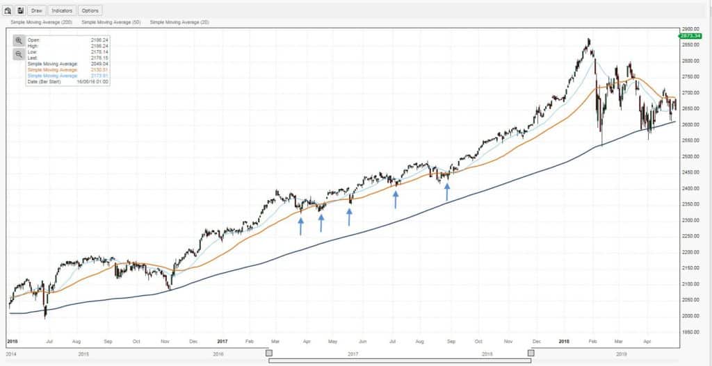
In 2016, investors were primed to buy when S&P landed at its 200-day MA. But as the year turned to 2017, the chance of a return to the 200-day MA looked ever less likely as the market rally kicked up the pace. In this scenario, market participants are now a little more antsy and trigger happy; willing to buy well before a larger decline can develop. The blue arrows show where investors were buying, buy zones coinciding with the faster 50-day MA.
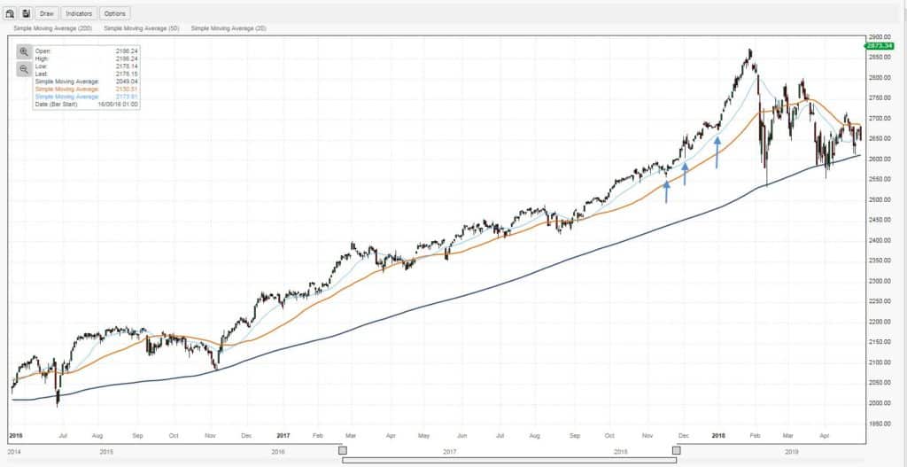
Greed continues to fuel the rally in the latter part of 2017 and into early 2018. Sharper gains deliver faster profits, but traders are having to buy earlier and earlier to participate in the fun. This quickly scales out of hand from been able to buy on moves back to the 20-day MA by the end of 2017, to firing well beyond that in early 2018.
Year 2018
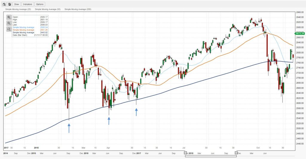
When 2018 rolls in we have a picture where investors have driven the S&P to a price level well above its 20-day MA. However, when the inevitable decline happens, the exuberance of the buying turns into more panicked selling – forcing many of these 2018 buyers into holding new losing positions within the space of days or weeks. This panic also means earlier support offered by buying at 20-day and 50-day MAs doesn’t occur, in large part because it has no time too. It’s only when the S&P gets back to the 200-day MA that investors try again to buy stocks. And, initially, this strategy works as shown by the arrows.
But this is only the start of a period when greed transitions into doubt. When markets or equities reach down to their 200-day MAs, strong buying at this level best shows itself with a quick reversal. Unfortunately, here we have three separate 200-day MA tests in February, March and April. The quick succession nature of tests points to a large area of potential supply (of shares) from investors trapped in losing positions at higher prices looking to get out before further losses are accrued; it’s their selling which is bringing the S&P back to the 200-day MA and the ever-shrinking pool of buyers looking to pick up the slack.
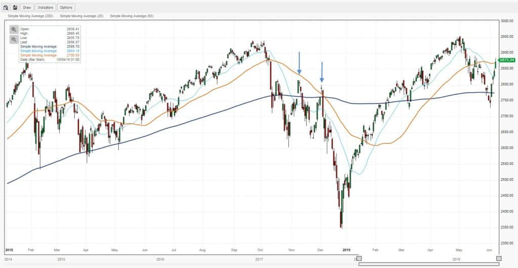
It’s only when we get the first clear breach of the 200-day MA in October, that the doubt radar really kicks into high gear. The initial break is quite shallow and recovers quickly but is unable to get above its 50-day MA. A second attempt is made on the 50-day MA, but this test fails too sending prices down into a V-bottom.
Year 2019
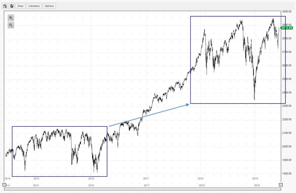
What’s left is a situation like the picture from 2016. The question now is, which market outcome will prevail? Can investors drive demand to push the S&P above 2,950 or sell it to bring a drop below 2,350? Or will indecision reign and the S&P will spend the rest of the year bound by the yearly high/lows. For investors, this is a time for patience where the “hold” in the buy-and-hold strategy often reigns supreme, but this can be hard to do when surrounded by all the noise generated by media in the marketplace.
Next month, we will use the ChartIQ component to study how technical indicators can be used to help.


