By Tim Thornton
KX has a broad list of products and solutions built on the time-series database platform kdb+ that capitalize on its high-performance capabilities when analyzing very large datasets.
KX Analyst is a powerful graphic user interface combined with an integrated analytics package which puts the power of kdb+ in the hands of business users so they can take advantage of its speed, without needing to learn the underlying language, while also enhancing the capabilities of the developer and data scientist by providing an IDE rich in productivity features.
In this series, we are taking a look at what makes KX Analyst such a powerful tool for sophisticated domain users. The first article in the series discussed modern data extraction and preparation. This second article focuses on visualization for exploratory data analysis (EDA). With KX Analyst, a programmer can visualize more data faster because it takes advantage of the processing performance of kdb+. Learn how below and check back to the KX blog for more articles in this series.
Introduction
In our previous article, we made use of the visual ETL tools available in KX Analyst to ingest, clean, and enrich taxi and weather data. This data has been imported into our kdb+ process and is now ready for further exploration and analysis. This article will focus on visual analysis. KX Analyst provides visualization tools specifically designed to take advantage of the performance of kdb+ focusing primarily on exploratory data analysis (EDA).
Visualization
Data visualization serves two major functions:
- Exploration: Visually explore a data set (EDA), and
- Reporting: Communicate information to others
When starting an analysis on a new data set, it is often useful to get a visual representation of the distributions and relationships within the data. To illustrate this, take Anscombe’s Quartet, a set of four small tables that have the same, or very similar, statistical metrics including mean, variance, and correlation. However, visually inspecting these tables tells a very different story:
The central lesson from Anscombe’s data set is the value of visually inspecting the data and looking deeper than aggregated statistical measures. For that reason, as we seek to understand the distributions and relationships in the variables within our data, we typically select plots such as Histograms and Scatterplots, which make the best use of the principles behind human visual perception for viewing one-dimensional distributions and two-dimensional relationships.
Rapid Visual Exploration
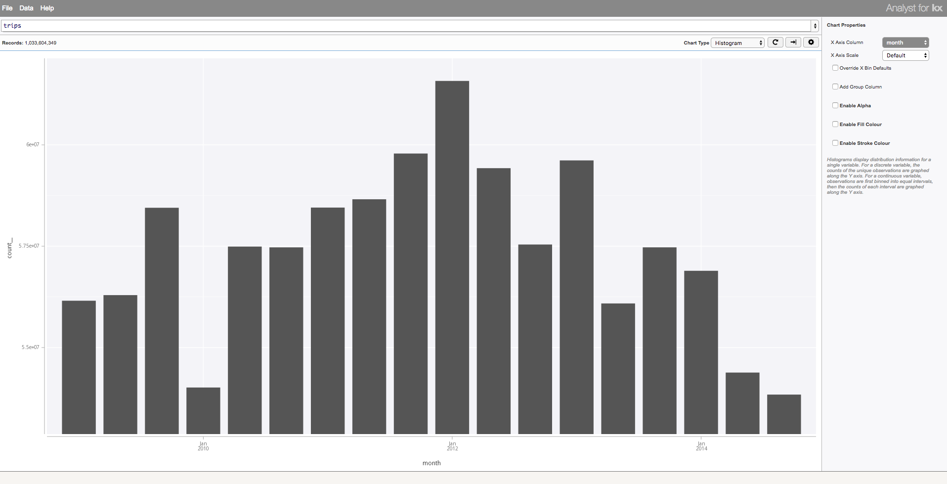
The Visual Inspector, part of the visualization suite available in KX Analyst, is designed for exploration using these typical charts, among others. The Visual Inspector provides an easy to use point-and-click interface. All visualizations made in KX Analyst are fully interactive, supporting tooltips, zoom, and nested drill down. As shown below, simple charts, such the the temporal histogram of the one billion taxi rides previously imported, allow an analyst to view the distribution of the data. From here, additional features of the data can be mapped to non-positional attributes of the data (fill colour, opacity, grouping, etc), and allow an analyst to test various distributional assumptions by changing the scale (linear, log, categorical, etc).
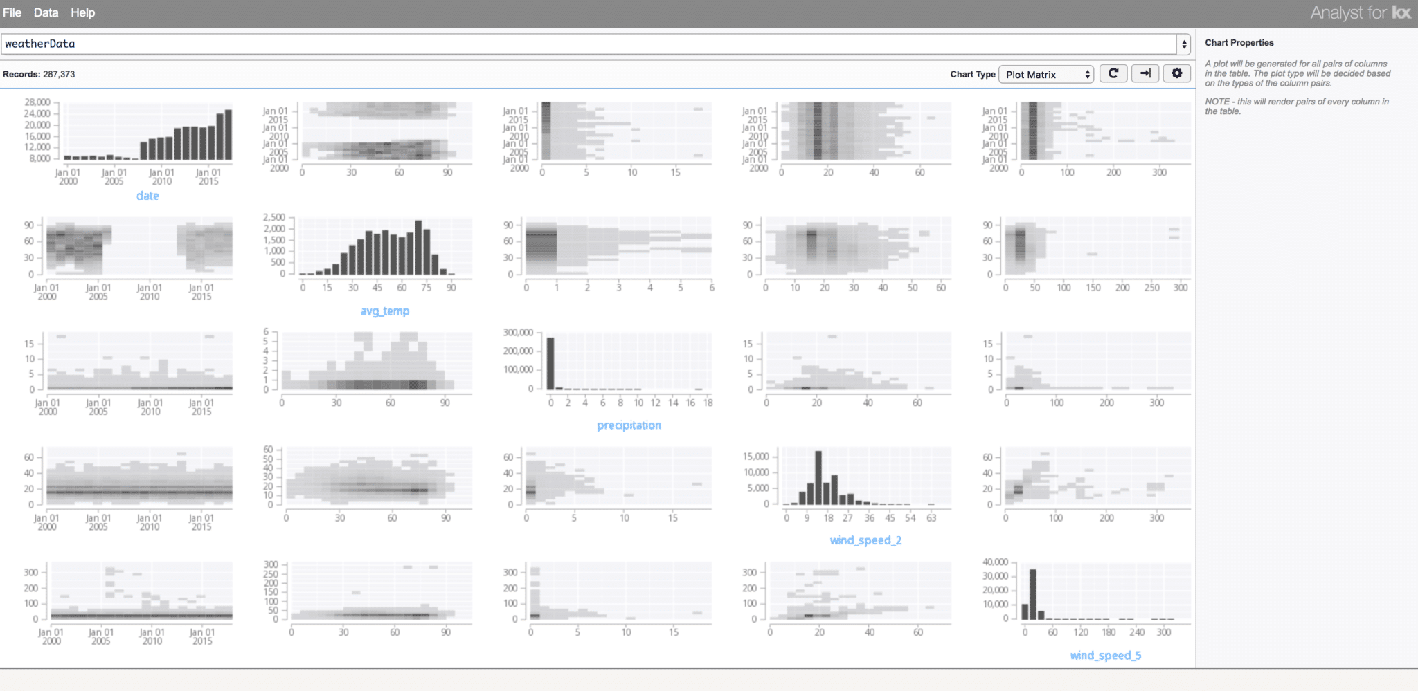
If nothing is known about the data, a Generalized Plot Matrix (GPM), which combines histograms, scatterplots, heatmaps, and box plots, can be an effective starting point. Below, we inspect the weather data we previously imported using the Plot Matrix. A histogram for each column is depicted along the diagonal, showing the distribution of each column. In addition, all relationships between the columns in the data are depicted, hinting to any possible correlations in the data. This image quickly conveys the date, temperature, precipitation, and wind components of the weather data.
In the Visual Inspector, differing from many GPM displays, the individual plot for each relationship is chosen by both the amount of data to display (determining whether to aggregate the data to avoid over-plotting – plotting data points on top of each other such that visual inferences about data density could be false), as well as whether the data is quantitative or categorical.
The Visual Inspector provides interactive visualization capabilities for the most common charts, as well as geo-referenced charts, networks, and statistical charts such as Quantile charts for showing detailed distributions, and Box Plots for showing the five-number summary and outliers.
Performance
A primary focus of the visualization capabilities in KX Analyst is performance. Most browser-based visualization frameworks rely on client-side rendering of data. This works well for the second visualization task above (reporting), but requires additional overhead limiting it’s capability for exploratory analysis. Front-end visualization requires:
- Data to be delivered to the end-users web browser over a network
- Data to be modelled by the end-users computer
- Data to be rendered, typically as browser elements, though recent browser canvas-based visuals circumvent this by using only a single browser element canvas
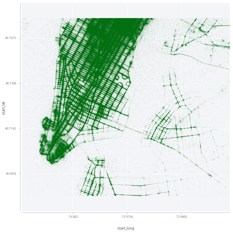
KX Analyst takes a different approach. By transferring the rendering obligation to the server rather than the client, KX Analyst avoids all three of these additional overheads. This means that a kdb+ programmer can visualize more, faster: the larger server, paired with the processing performance of kdb+, is able to rapidly process and render charts and only the resulting image is sent to the end-users browser. In addition, since the rendering happens close to the data, no data transfer is required, allowing visualization of the raw data points, even for large data sets, such as the display of each individual taxi drop off point from our previously ingested data:
Interactive exploration
Even with the performance coming from server-based rendering, visuals in KX Analyst support client-side interaction in the usual manner. In addition to tooltips and zoom, chart type or properties can be manipulated at any zoom level, maintaining the subset of the data in view. This allows for a fluid, streamlined, interface to narrow down a data set to specific points of interest, and enables an analyst to answer questions that a single chart would not have been capable of answering.
Deep Custom Visual Analysis
At a certain point during exploratory analysis, analysts may want more expressive visualization capabilities beyond the default charts available in the Visual Inspector. KX Analyst provides a visualization library in the style of Leland Wilkinson’s Grammar of Graphics (GG), the ideas of which have inspired many popular visualization libraries such as ggplot2 in R.
The GG library in kdb+ enables visualization with the same performance characteristics as those in the Visual Inspector, with the ability for a q developer to specify entirely custom charts. The result is the unification of the visualization and analytics environments: q developers use the library to specify charts, and can use q’s flexible looping and composition to compose custom visualizations. In addition, the library allows q developers to keep analysis and supporting visualization together during exploration.
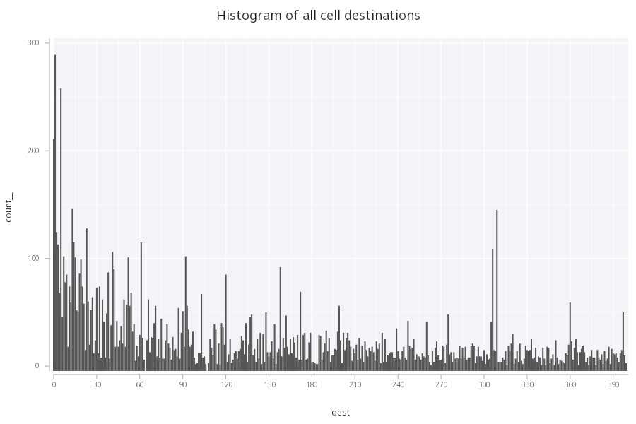
As a simple example, using telco data, we might start with a histogram to view the distribution of cell destinations, as could be done in the Visual Inspector. This can be constructed in the GG library with:
.qp.go[500; 300]
.qp.title["Histogram of all cell destinations"]
.qp.histogram[cells; `dest; .qp.s.binx[`w;1;::]]
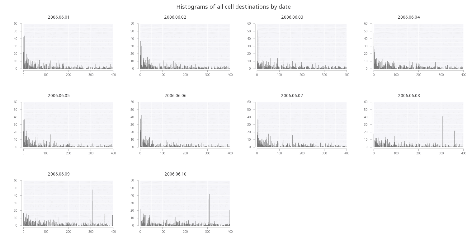
Since this data has a time-series component, we can take the above specification and split out each individual date by faceting the data on a particular column (here we are faceting on the unique dates) to view a single plot for each unique value:
.qp.go[500; 300]
.qp.title["Histograms of all cell destinations by date"]
.qp.facet[cells; `date]
.qp.histogram[; `dest; .qp.s.binx[`w;1;::]]
By doing this, we can see a sudden shift in the distribution in the last three dates that was masked by looking all the data at once. Faceting is one way to visualize a third dimension of the data.
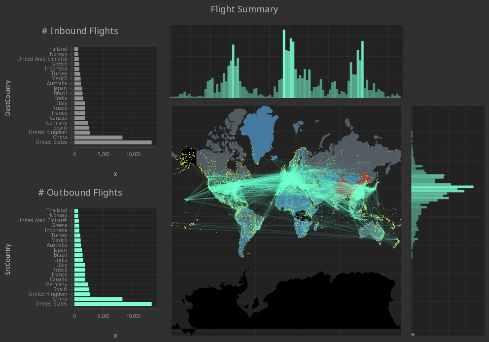
The idea behind the Grammar of Graphics is to provide a set of components with which all statistical charts can be specified. This conceptual framework enables q developers to create data- or domain- specific charts without needing to rely on a visualization library providing the chart they are after. The GG library provides a rich set of geometries that can be mapped to data, and composed to build up custom charts consisting of many data sets at once, and arranging individual charts into a single data display, as shown below.
In addition to the components for specifying visualizations, common layouts are available within the library enabling visualization of hierarchical data:
Iterative analysis through custom visualization
Pairing the components available in the library with q’s expressive composition, domain-specific visualizations can be built iteratively with very little code to aid both in EDA as well as communication and reporting. For example, although a candlestick chart is not directly included in the library, the chart can be simply constructed by stacking two geometries together and setting the fill colour to indicate the direction of movement.
.qp.stack (
// A vertical rectangle between the open and close
.qp.interval[ohlc; `date; `open; `close]
.qp.s.aes[`fill; `gain];
// A line segment between the high and low
.qp.segment[ohlc; `date; `high; `date; `low]
.qp.s.aes[`fill; `gain]);
This simple chart is used in combination with other geometries in the below left image, building up moving averages, moving average convergence/divergence, and indicators into one chart. These geometries are typically added iteratively to the chart to check hypotheses and test relationships within the data:
Multi dimensional data
Multi-dimensional data can be handled simply by adding additional attributes to any geometry, such as fill colour and opacity, or by faceting as shown previously. However, these strategies require two primary dimensions, those used for positioning the geometries. This visually favours the positional dimensions since position is a much more effective indicator for graphical perception than attributes such as fill colour and opacity, according to a study by Cleveland and McGill.
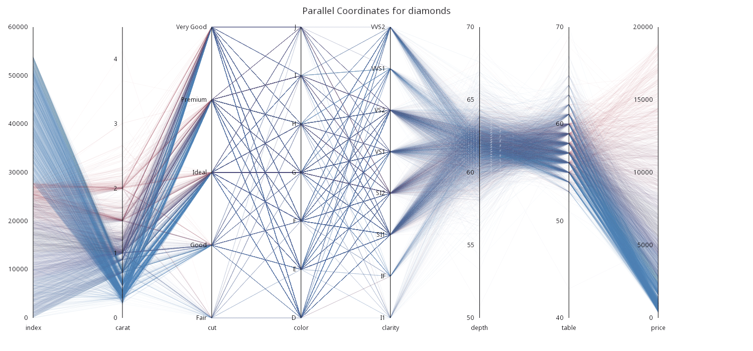
Using the flexibility of the Grammar of Graphics, custom displays such as Parallel Coordinate Charts, as shown below, can be created despite not being included as a first-class chart. Parallel Coordinates can be an effective way of visualizing multi-dimensional data on many parallel unaligned scales, allowing each dimension to be used as a positional dimension. The chart below depicts the relationships between eight features of diamonds data. This visualization technique can be scaled horizontally to add many additional features of the data, though the more distant two dimensions lay within the visual, the more difficult it is to derive their relationship.
Summary
The use of data visualization accelerates exploratory data analysis and enables communication of quantitative information to others. KX Analyst includes visualization tools designed to leverage the performance of kdb+ for non-developer analysts through the Visual Inspector, as well as q developers through the GG library.
In the next article, we will examine the kdb+ development environment and developer tools available in KX Analyst.
Data Acknowledgements
The data used in these examples is open source and publicly available from the following sources.
- Anscombe’s Quartet: https://gist.github.com/ericbusboom/b2ac1d366c005cd2ed8c
- TLC Trip Record Set: http://www.nyc.gov/html/tlc/html/about/trip_record_data.shtml
- NYC Weather: https://www.ncdc.noaa.gov/cdo-web/datasets/GHCND/locations/CITY:US360019/detail
- Map of the Market: https://github.com/atcemgil/notes/blob/master/fe588/sp500f.csv
- MACD: https://finance.yahoo.com/quote/AAPL/history?period1=1454302800&period2=1475294400&interval=1d&filter=history&frequency=1d
- Diamonds: https://github.com/implydata/datazoo/blob/master/diamonds.csv
References
William S. Cleveland; Robert McGill. (1984). Graphical Perception: Theory, Experimentation, and Application to the Development of Graphical Methods. Journal of the American Statistical Association, Vol. 79, No. 387, pp. 531-554.

