By Declan Fallon
In our last post we had used the power of pivot to drill through and draw some general conclusions on our data. For example, the most loyal customers those opted ‘all-in’ on the services they use – fibre-optic internet and availing of add-on support options. Families were also long-standing customers, while those with just a phone service spent the least and had the shortest stay with the company. This information could be drawn using KX Dashboards pivot interaction, data can also be examined using a Data Form.
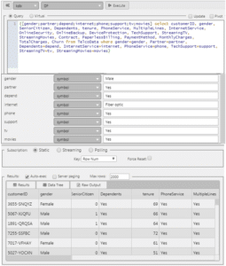
KX Dashboards Data Form makes working with your data easy as it automatically identifies assigned view state parameters from your query. Using our Telco data1 set we can modify our basic query to include some user inputs (highlighted in bold) – this will initially be done inside a Data Grid before working with the Data Form.
In the Data Grid, create a Data Source called ‘DataForm’
And use the following query:
{[gendr;partner;depend;internet;phone;support;tv;movies] select customerID, gender,
SeniorCitizen, Dependents, tenure, PhoneService, MultipleLines, InternetService,
OnlineSecurity, OnlineBackup, DeviceProtection, TechSupport, StreamingTV,
StreamingMovies, Contract,  PaperlessBilling, PaymentMethod, MonthlyCharges,
 TotalCharges, Churn from TelcoData where gender=gendr, Partner=partner,
Dependents=depend, InternetService=internet, PhoneService=phone,
TechSupport=support, StreamingTV=tv, StreamingMovies=movies}
As an initial step, I have set default values to ensure the query populates the results correctly, but will be changing these to use view state parameters.
Mapping the default values to view states is easy. Start by rolling over the first of the default input values, in this case for gender. This will reveal two icons, one of which will have a cog-icon overlay:
Click on the cog-icon to automatically assign a view state parameter to this variable.
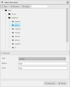
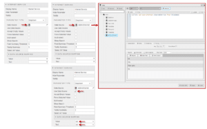
Repeat for all eight input variables. If you click on the eye icon (now positioned on the left) you will see each of the variables will have assigned dashboard’s views states within a ‘DataForm’ folder (the folder name is taken from the query name)
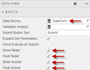
Now bring in the Data Form component to our dashboard. The “Data Source” is the one used by our Data Grid so it picks up the input variables assigned in that query; when we make changes to the inputs in our data form, the results will be returned in the data grid.
When configuring the Data Form use the same query as used in our Data Grid:
This will automatically populate the Data Form with the eight (text) inputs from our view states using the earlier defined default values:
Adding a Dropdown
The majority of our inputs are simple Yes/No responses but some of the search inputs require a bit more information. For example, Internet Service offers a choice of ‘Fibre Optic’, ‘DSL’ or ‘none’.
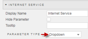
With a Data Form we can create a dropdown menu populated with available options to make it easier for the dashboard user to select. To avail of this, change the Parameter Type for the input variable from Default to Dropdown.
Defining the list of available options for our dropdown can be done with a data source or by manually adding individual row items. The data source method is recommended.
The following query (‘distinctInternet’) will create a list of distinct values for Internet Service:
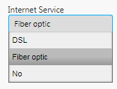
([]list: asc exec distinct InternetService from TelcoData)This is assigned to the Data Source for Internet Service. As part of this, a check for Use Data Source is required along with an assignment as to which data source column is to be used for values, and which is to be used for labels in the menu itself – in this case, the same column ‘list’ is used for both Value and Text.
Now the dropdown menu looks like this:
Show me the Data
In our first article we had used highlight rules to provide color to our Data Grid, but data grids offer alternative methods of looking at our data, one of which is Grouping.
Grouping allows Users to reorganise the presentation of the table into categories with the option to include summary statistics
Grouping is enabled by default
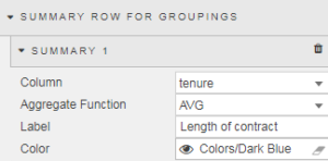
To add summary information, we can define it from Summary Row for Groupings. To start click on
The first summary is for average Monthly Charges. For continuity, we can assign a text color (#6e8cb1) created as a view state as used in our first article. We can create additional summaries for Total Charges and Tenure too.
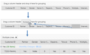
For a User to create a summary, they only have to click-and-grab the column header, and then move it to the drop zone above the column headers.
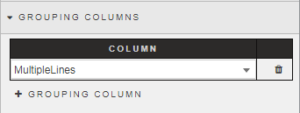
Groupings can also be pre-loaded from Grouping Columns in Data Grid properties.
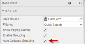
And the groupings can be minimized to only show summary values on loading the dashboard
Bring it all Together
Now, we can use the combination of the Data Form along with column groupings to investigate our data.
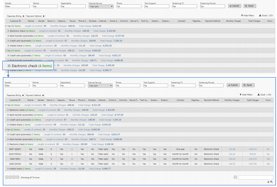
If we set filters for men with partners, kids, streaming TV and movies and fibre optic broadband with tech support – a typical high spend demographic from our pivot analysis, and then group by paperless billing and payment method we get:
We can see from our groupings that credit card payees are paying similar amounts per month as electronic check payees but stay with the company longer.
More stark is the length of time electronic check payees stay with the company when paperless billing is not used; the electronic payee don’t stay beyond 2 years, compared to 5 years for credit card and direct debit payees.
From a marketing perspective, getting customers – irrespective of billing method –to move from electronic check payment to direct debit or credit card increases the chance they will stay with the company for longer.
1: https://www.kaggle.com/blastchar/telco-customer-churn#WA_Fn-UseC_-Telco-Customer-Churn.csv

