By Declan Fallon
This month’s Insights post falls on Valentine’s day so today’s article will feature a dashboard visualizing data centered on romance. As a source we will use a blog post by dating site, Zoosk, which investigating generational differences in dating[1]. Zoosk has over 750K dating profiles and its members have generated nearly 250 million messages using the site’s mobile app and website. Zoosk publishes occasional articles using data generated by its members, presenting their findings with simple tabulated outputs. The goal here is to visualize some of their findings and see if we can draw any additional conclusions from their data.
Step 1
The plan is to focus on using a series of Canvas Charts which we will overlay on a background image to give our dashboard the appearance of an Infographic.
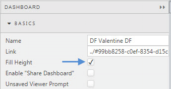
We will be making extensive use of the Advanced Layout functionality of the Layout Panel, so the first step is to add a Layout Panel to the dashboard and have this fill the screen. To do this we have to enable Fill Height from the Dashboard settings.
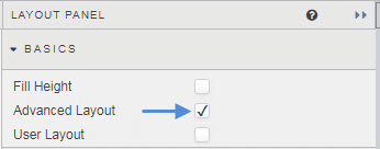
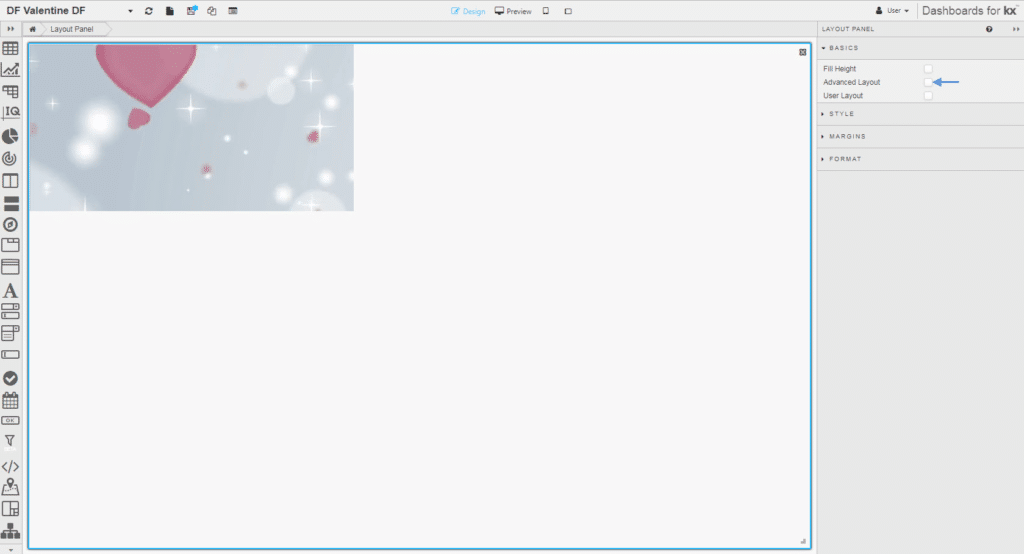
Then in our Layout Panel, we enable Advanced Layout; the latter functionality is only available in Layout Panel, hence why we need to add it to our initial, blank dashboard.
Over the course of the build we will need to toggle check the Advanced Layout as we look to add components and position them. Dashboards make this easy by allowing you to select any component using the breadcrumb element along the top of the editor. This will set the Properties panel on the right to focus on the selected component.
We are going to add our background image first. The image used should be sized to the scale of the screen (e.g. 1920 x 1080 for HD) you want to fill. We will be adding our image to a Text component, so add this component first.
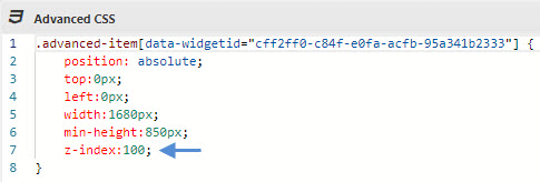
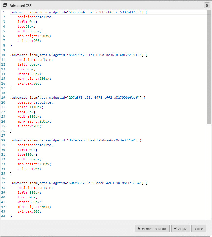
Because we are using Advanced Layout we have to use CSS to scale the Text component to fill the screen. For this particular dashboard, my available screen size is 1,680 x 850 so my Text component CSS will look like this (remember to include the .advanced-item prefix before the Text component widget it):
Included in the CSS is the z-index. We want to set priorities on our components so our Canvas charts sit over our background image, and we use z-index to achieve this.
Step 2
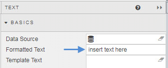
Next, I add my background image. This is done from the Formatted Text of the Text component
When I add my Text component I don’t resize it to fill the Layout Panel, the CSS will handle this when I enable Advanced Layout. We need room to add new components, so it’s important not to fill up the Layout Panel with fit-to-scale components as we may find ourselves in a situation where new components will replace components previously added.
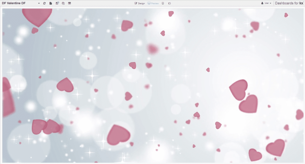
So our Preview mode with Advanced Layout enabled will look like this:
Our workspace will look like this (note, how I have unchecked Advanced Layout):
Every time we want to check how our dashboard looks we will check the Advanced Layout box, but uncheck it when adding and editing our components.
Step 3
Now, I want to add a Canvas Chart.
The Canvas Chart will use an input variable to switch between different questions. We can then cut-and-paste the Canvas Chart component and change the question to return different data from the one data set. We could apply a view state parameter and use a Drop Down List to achieve this but as we are doing an Infographic we will hard-set the question variable.
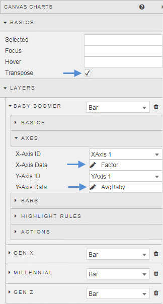
For the Canvas Chart, we add layers for each demographic of Baby Boomer, Generation X, Millennial and Generation Z. We will also Transpose the chart and add a title to represent the question
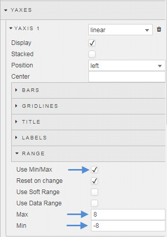
I have also standardized the y-axes chart range using Min/Max
When applying CSS we can use any component Style property to host the content, so we will use the Style property of the Layout Panel to keep the CSS for our Canvas Charts together, we just need to ensure we use the correct widget ids.
So our first Canvas Chart has a CSS map as follows. Remember, we are using the z-index to layer our components and want the chart to sit above the background image, so the z-index of the Canvas Chart has to have a higher value than the Text component hosting our background image.
With this in place we can now repeat for the eight other charts, changing the question variable in the query to match each question. As we are using the Layout Panel to host the CSS we can quickly make adjustments to ensure all components are positioned correctly; here it was necessary to make changes to the width and height of each chart, and make room along the top of the dashboard for a Title Text component.
The Text Component used for the Title has its own CSS to position it at the top of dashboard. To help with the clarity of the charts, the colors of the background image were faded using a transparency. At same time, stronger chart colors were used to help improve their visibility.
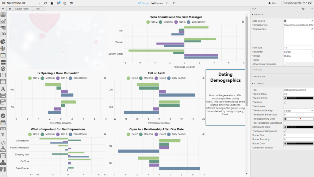
Our dashboard in Design mode looks like this.
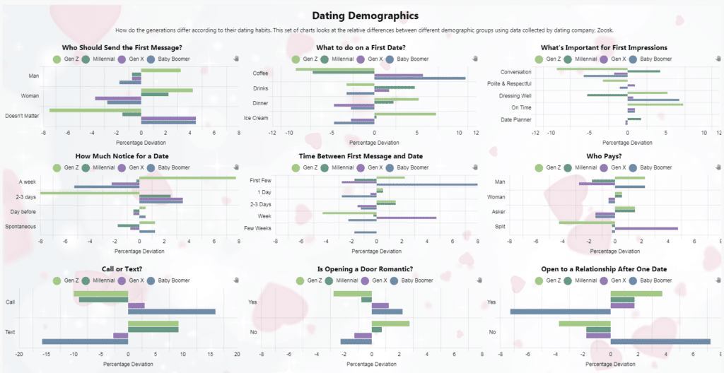
But when we re-enable the Advanced Layout it becomes of the Layout Panel it becomes:
What does the Data Say?
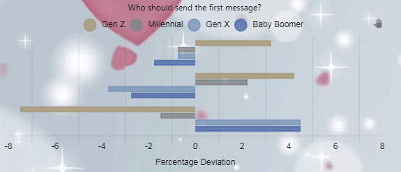
- Generation X and Boomers are the most open about who gets in touch first. Generation Z are too busy with Fortnite so it’s left to women to show interest first.
- Generation X and Baby Boomers kept things simple and opted for a coffee as a first date. Generation Z wanted a proper meal with their date, but often could only afford ice cream, while Millennials, stressed over property prices, decided meeting for a drink would be the best way to drown their collective sorrows.
- On the date, Millennials value the ability to hold a conversation – while having a drink – as important. Generation X, on the other hand, were all confused and didn’t know what they wanted; so simply having their date turn up would probably be enough to keep them happy.
- While most daters were fine with a couple of days’ notice for a first date, Generation Z – while insisting their dates turned up on time – were presumably waiting for flowers, a poem and maybe a serenade in the minimum one-week notice period prior to meeting.
- Baby Boomers, thinking perhaps that their next date maybe with Death, didn’t want to waste time messaging and wanted to meet up ASAP. Meanwhile, Generation X drifted around in their Kurt Cobain t-shirts and ripped jeans for a week before committing to a first date.
- At the end of the date, Generation X both looked at their shoes when it came to paying for what was often just coffee. Generation Z have decided Baby Boomers have it right and want men to pay for their lobster dinner.
- Communicating is important, at least for Boomers who are happy to call to arrange a date. A sequence of emojis is deemed enough for Generation Z when arranging their date.
- Boomers and Gen X did like having doors opened for them; Generation Z didn’t mind, as long as the man paid for dinner.
- Finally, in terms of committing to a relationship, Generation Z were fine after one date, but Boomers wanted a few more coffees before going steady.
[1] https://www.zoosk.com/date-mix/dating-data/generational-dating-differences/
